Updated Dec 3, 2025
Variables
Collections
Variables are grouped into four collections, each handling a specific part of your design system

1. Primitives
This collection includes standard Tailwind utility-based values. It’s designed to match the utility-first approach used in shadcn/ui.
Use these variables to:
Set component dimensions (height, width) and spacing
Define borders, including radius and stroke width
Adjust opacity values
Set line-height for text styles
Group | Usage |
|---|---|
| Border radius values for rounded corners |
| Set border thickness |
| Control the height of components and individual elements |
| Set minimum and maximum width constraints for components or individual elements |
| Adjust element transparency |
| Control the width of components and individual elements |
2. Theme
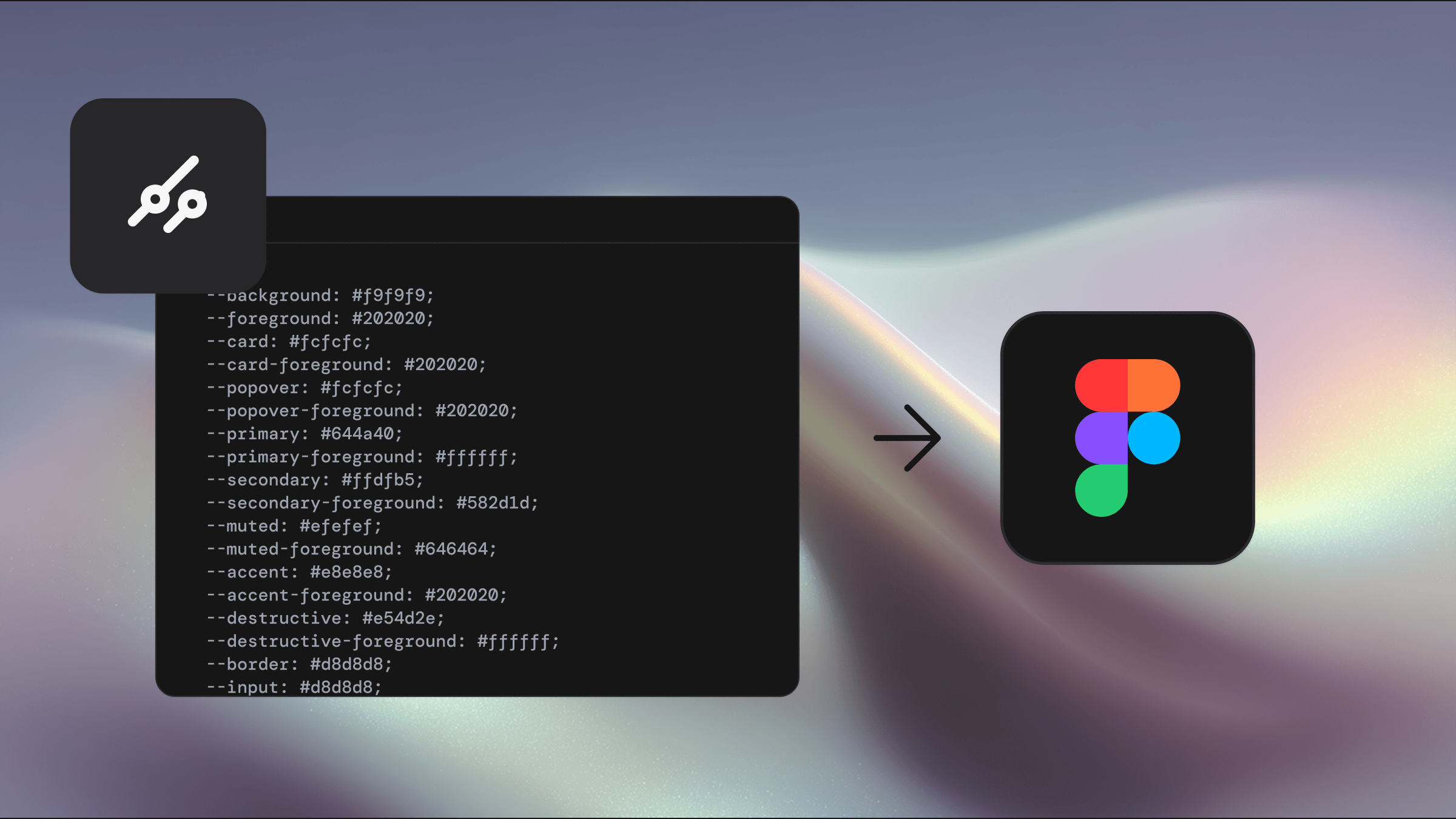
Edit these variables to apply your brand styling. This is where the majority of the theming variables live for light and dark mode in Shadcraft. The Theme collection allows you to house multiple brands with unique styling from the one library.
Use these variables to define theme-specific:
Spacing
Typography
Shadows
Radii
Group | Usage |
|---|---|
| Define the color palette used for your theme |
| Misc things like icon border width |
| Control all the facets of typography including family, size and weight |
| Theme-specific radii – references Primitive collection |
| Define all the properties of the various shadows |
Color variable usage guide
color | Usage |
|---|---|
| Define the color palette used for your theme |
| For elements on top of primary |
| Your secondary brand color |
| For elements on top of secondary |
| Highlight color for active or focused elements |
| For elements on top of accent |
| Main application background color |
| For elements on top of background |
| Background color for cards |
| For elements on top of card |
| Background color for things like select menus |
| For elements on top of popover |
| Subtle background for elements requiring less attention |
| For elements on top of muted |
| For errors and destructive actions like delete |
| For elements on top of destructive |
| Main border color |
| Border color for form input elements |
| Helps define the focus indicator |
| Applied to elements to lighten their background color |
| Applied to elements to lighten their background color |
| Applied to elements to lighten their background color |
| The soft outer focus ring on focussed elements like buttons |
| The soft outer focus ring on focussed elements like destructive buttons |
| Used for the background of elements like input to increase contrast in dark mode. More info here |
| Used in the backgrounds of elements on hover like Combobox |
| Used for input element background like Switch |
Mode
These are the colors you apply to elements in your library. They enable the use of light and dark modes. These reference variables in the Theme collection.
Group | Usage |
|---|---|
| The majority of colors for UI in Shadcraft. These reference colors in the theme collection. |
| Figma-specific colors used to achieve the shadcn/ui look. |
| Colors used for charts |
| Colors used for shadows |
| Colors specific for the sidebar component |
Pro
These are variables specific to the Pro Figma UI Kit only
Group | Usage |
|---|---|
| Semantic variables to handle spacing across all marketing blocks |
| Semantic variables to handle spacing across all application blocks |
Best practices
Use variables instead of hard-coded values to maintain consistency across your designs.
Apply Mode variables to any elements that need to respond to light or dark themes.
Use the collections in different ways:
Alter the values of Theme for Theme-specific styles
Apply mode variables rather than editing their values
Following these practices ensures your Figma designs stay aligned with the shadcn/ui framework and are easily translatable to Tailwind CSS in code.