Updated Aug 20, 2025
Components
The Shadcraft Figma kit offers a comprehensive set of components that align with the official shadcn/ui framework. This section walks you through how to work with components in Figma — from basic editing to documenting changes for developer handoff.
Editing components
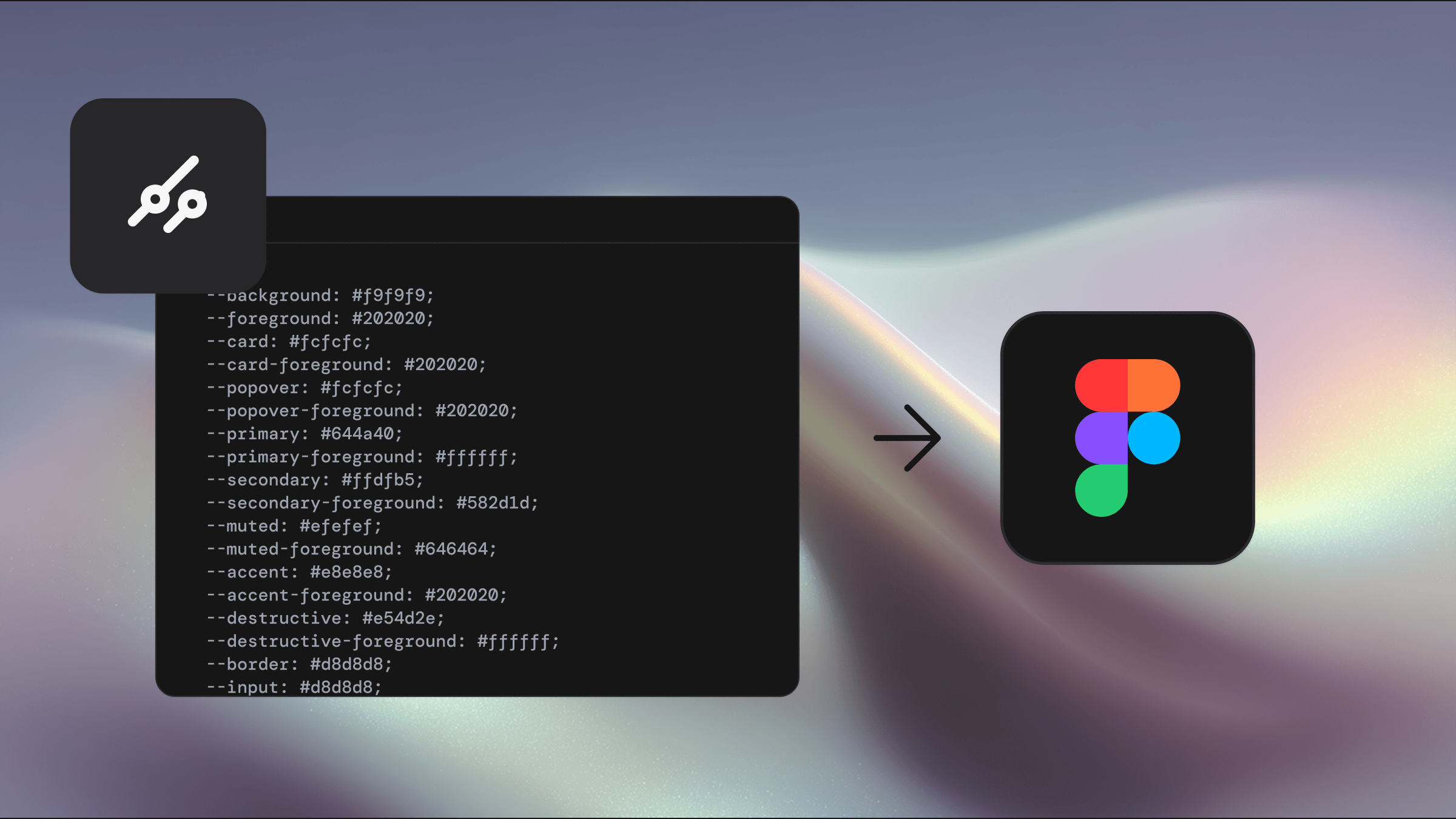
Each component in the kit is styled using Tailwind CSS utility classes. In Figma, we replicate this structure by using variables from the Primitive, Theme, and Mode collections, along with shared styles. This setup ensures visual consistency and allows for easy updates across your design system.
Example: Editing the tooltip component
Let's say we want to modify the Tooltip component to have a slightly larger font size.
Navigate to the Tooltip page in your main library file
Locate the component named Tooltip / Text inside the Components section
Select all the Tooltip component variants
Change the label text from
text-xstotext-base
Implementation in code
Developers can now update the component in code based on the design edits:
Open the
ui/tooltip.tsxfileReplace the
text-smclass withtext-baseSave the file and verify the changes in the Ul
Because the Figma variables map directly to Tailwind classes, the design-to-code handoff is fast and accurate.
Creating new components
If you're designing a brand-new component, follow these guidelines to maintain consistency with the Shadcraft system:
Start with a Frame using the correct constraints and resizing behaviours
Add text using predefined Text Styles
Apply colors from the Mode collection (to support light/dark themes)
Use Primitive variables for spacing, sizing, borders, and radius
Use auto-layout wherever possible
Hit option+d6+K to convert the frame to a component
Add variants for different states where needed (e.g. default, hover, focus, disabled)
Use Figma properties to organise toggles, slots, or variants cleanly
Add usage documentation within the Figma file to help developers understand the intent and flexibility
Pricing
Upgrade anytime. Pay only the difference between products.
Select license
Single
Team
Enterprise
For solo designers and developers
Fast support • Unlimited projects • Lifetime updates
Base
All official shadcn/ui components and blocks in Figma. Everything you need to start designing with a strong foundation.
Easy theming via our plugin
All shadcn components
All shadcn blocks
All 5 complete icon sets
Tailwind CSS alignment
Prototype interactions
Figma variables
Light & dark mode
Pro
Pro Components, Blocks, and Templates. A complete Figma UI Kit that lets you assemble polished layouts in seconds.
Everything in Base
42+ Pro Components
132+ Blocks to ship faster
Full page Templates
Perfect for marketing sites
Ideal for product apps [New]
Assemble sites in seconds
Responsive layouts
+
Pro React
Pro Figma UI Kit plus matching React components. Build production-ready interfaces with aligned design and code.
Everything in Pro
Pixel perfect design parity
Zero setup needed
Composable / extendible
Production ready blocks
Fully responsive
shadcn aligned tokens
CLI install & MCP support
Prices in USD.
Secure payment with Polar.sh
+
Free
Looking for a free option?
Access a curated set of shadcn components in the Figma community library, try tweakcn theming, and use the free Shadcraft registry. A simple way to trial the kit before upgrading.
Blog
shadcn/ui insights and Shadcraft news
Blog
shadcn/ui insights and Shadcraft news
Blog
shadcn/ui insights and Shadcraft news


Stay in the know
Keep updated on all things happening with Shadcraft.
We respect your privacy
Stay in the know
Keep updated on all things happening with Shadcraft.
We respect your privacy
Stay in the know
Keep updated on all things happening with Shadcraft.
We respect your privacy