Updated Feb 1, 2026
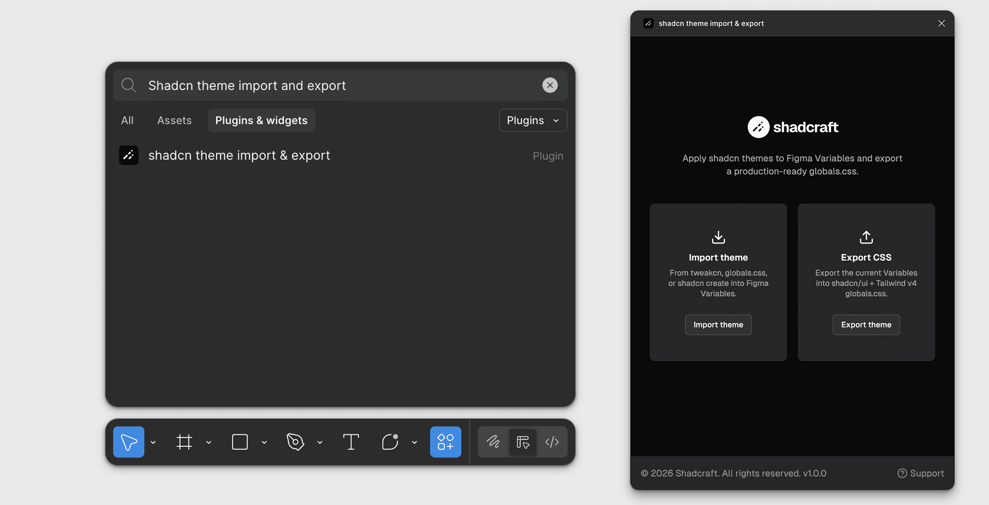
Instant theming
All theming now happens inside the shadcn theme import & export Figma plugin, keeping your Figma variables aligned with shadcn/ui projects and Tailwind v4.
Supported actions:
Import themes from tweaken, shadcn create, or CSS code
Export current variables to global css

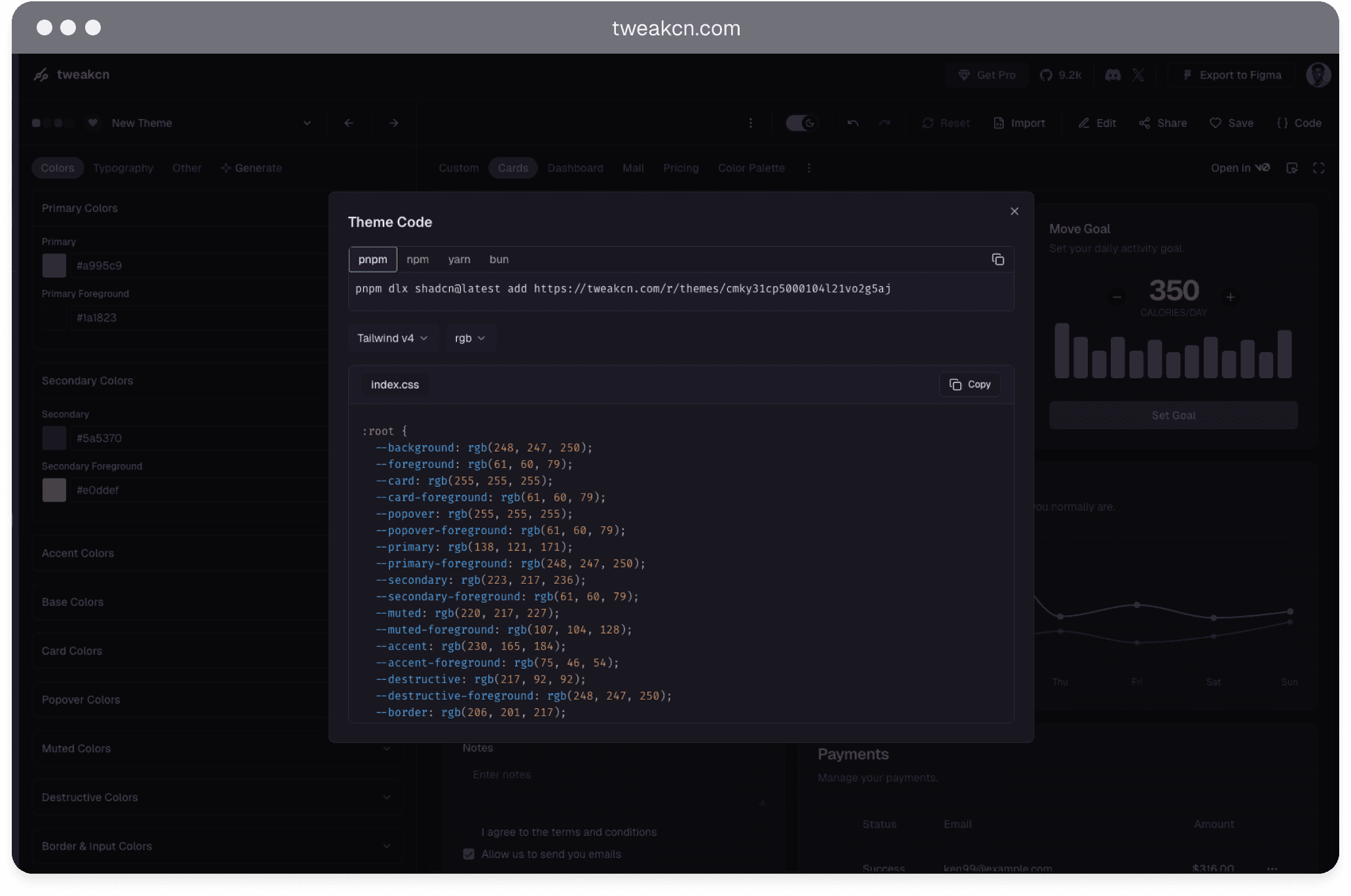
Theme with tweakcn
Applying a tweakcn theme
Open your Shadcraft library file in Figma
Select Import theme
Choose tweakcn as the source
Do one of the following:
Select a preset theme from the list
Paste a custom tweakcn theme URL
Click Apply
This creates a new mode inside the theme collection and applies it across the document. Existing themes are not overwritten.
How to get a tweakcn theme URL
Go to tweakcn.com
Create or edit a theme
Click “Save” in the top-right
Go to your profile and copy the saved theme URL
Paste this URL into the Shadcraft plugin import field
This URL contains all color, radius, and token values.
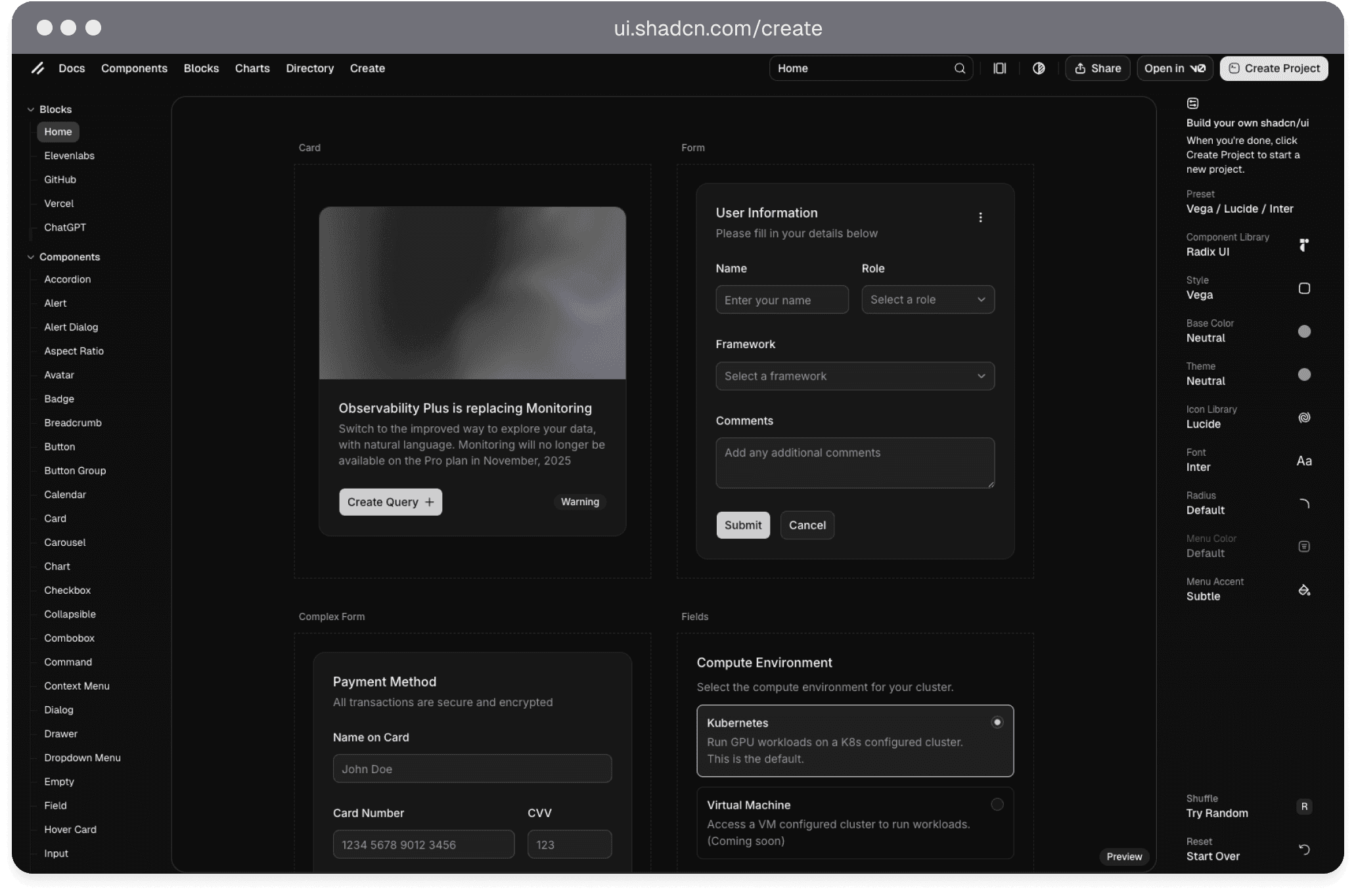
Theme with shadcn Create
Applying a shadcn theme
Open your Shadcraft library file in Figma
Select Import theme
Choose shadcn as the source
Do one of the following:
Select a preset configuration
Paste a custom shadcn Create URL
Click Apply
A new mode is created in the theme collection and applied to the entire document without affecting existing themes.
How to get a shadcn Create URL
Configure your project:
Colors
Radius
Fonts
Style preferences
Click share to copy the full URL
Paste this URL into the Shadcraft plugin import field
The plugin reads the configuration directly from the URL.
Theme with CSS
Open your Shadcraft library file in Figma
Select Import theme
Choose globals.css as the source
Enter mode/theme name
Paste your CSS code into the input field
Click Apply
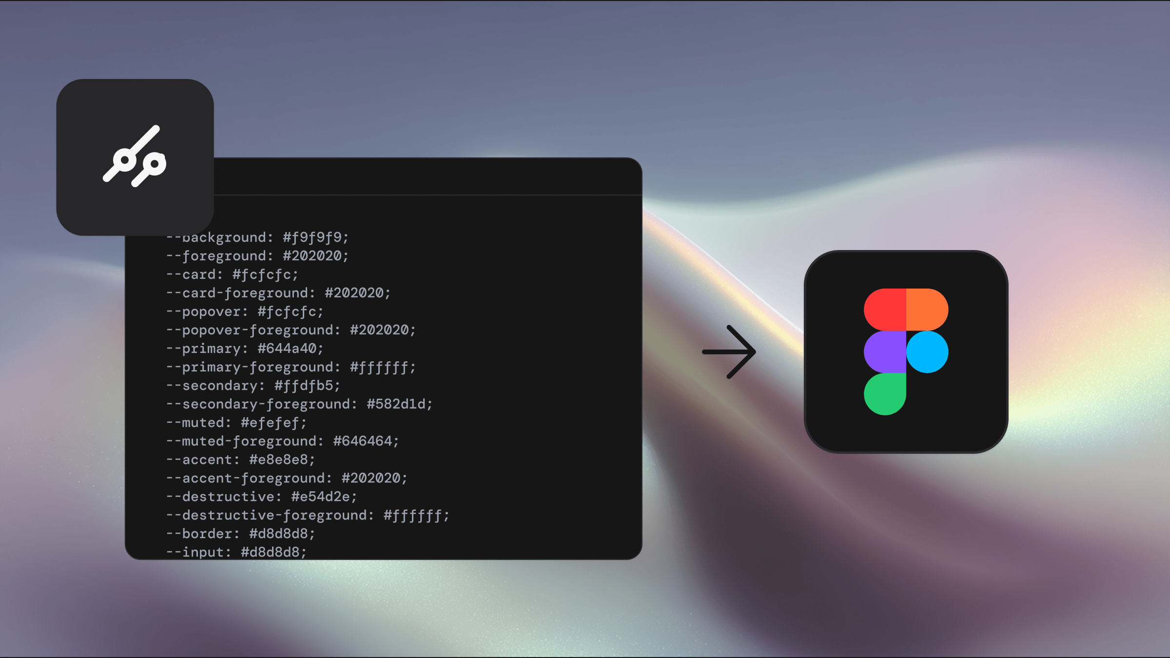
The CSS is parsed and mapped to Shadcraft variables, creating a new mode while keeping existing themes intact.
Export theme to CSS
Open your Shadcraft library file in Figma
Set how your CSS should be generated:
Theme mode
Select the mode you want to export (for example Light, Dark, Brand)
Tailwind version
Choose the Tailwind version (Tailwind v4 by default)
Color output
Select the color format (for example oklch)
Toggle the parts of the theme you want in the export:
Light mode
Dark mode
Sidebar colors
Chart colors
Radius
Font family
Shadows
Click Export CSS
Shadcraft generates a production-ready globals.css
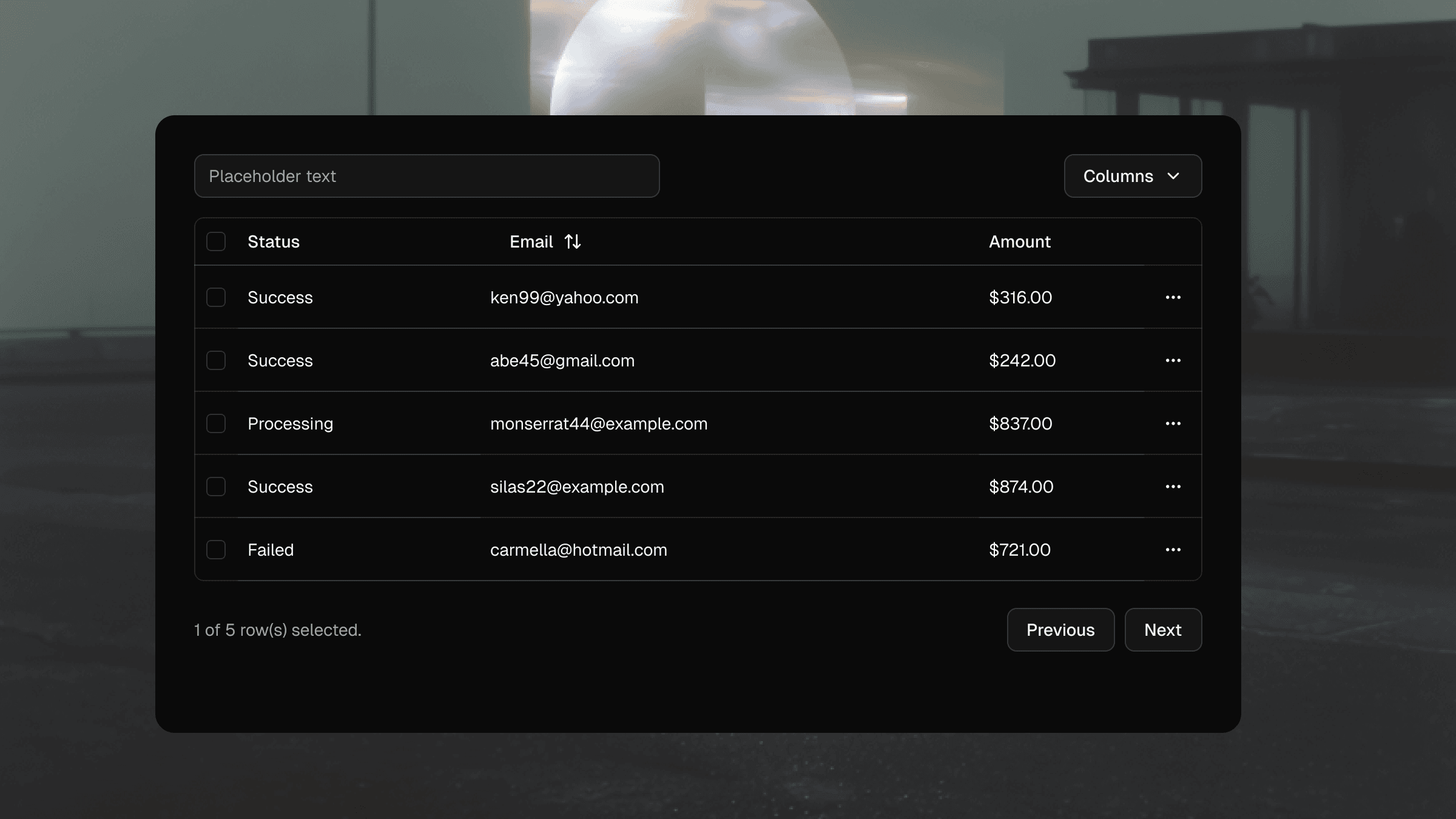
Get a preview
Use the theme preview to the right to get a handy snapshot of your theme across the entire library as you theme
Adding or editing variables
Theming may not break if you add new variables, but if you rename existing ones, it may cause theming issues
The export output is:
Compatible with shadcn/ui
Compatible with Tailwind v4
Based on the exact current variable values in Figma
You can copy the CSS directly or download it for use in your project.