Updated Aug 19, 2025
Getting started
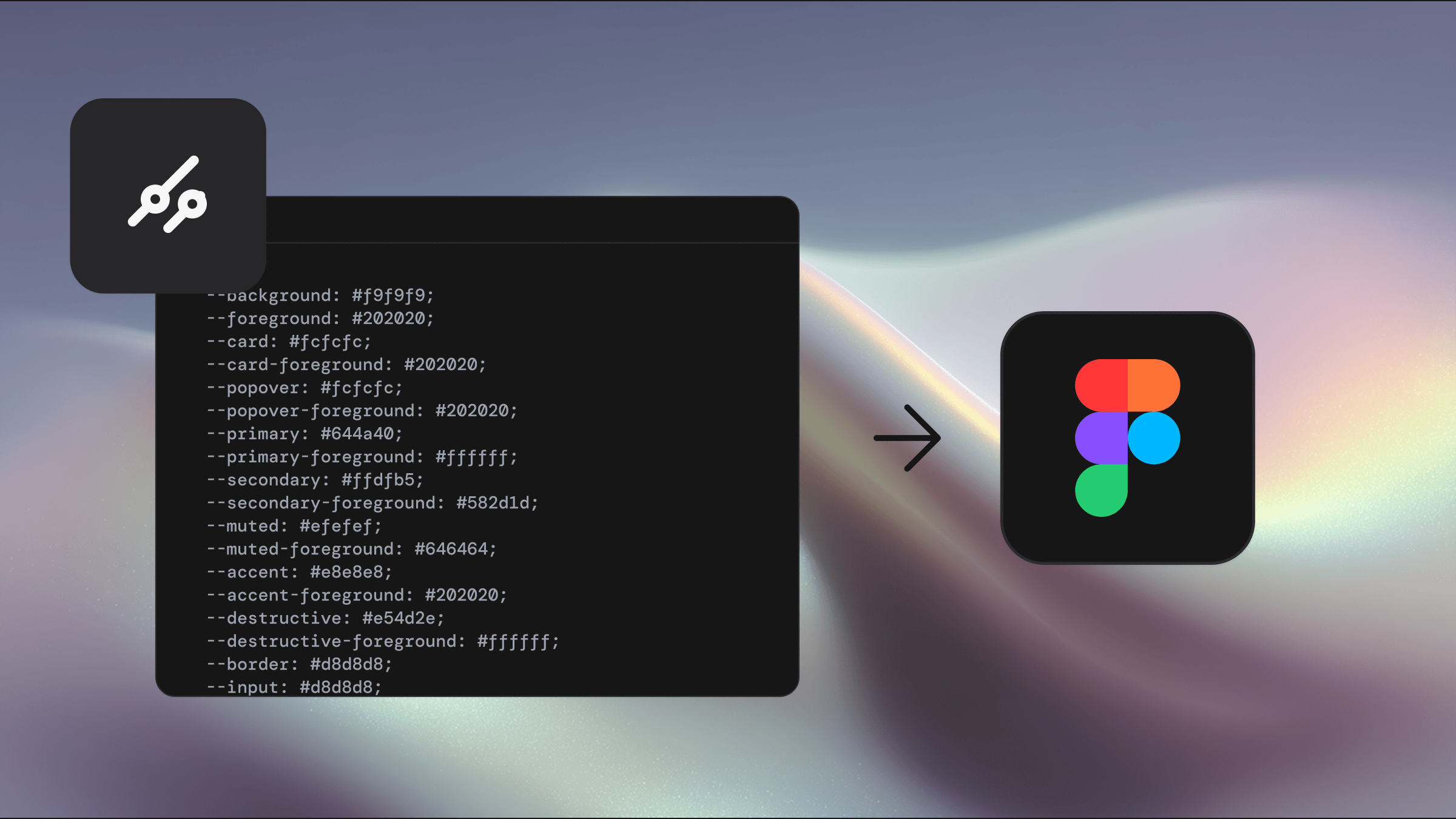
Using Shadcraft as a library
Step 1
Publish your library
Open your Figma file that contains all Shadcraft components and styles.
Go to the Assets panel (left sidebar) and click the book icon to open the Team Library modal.
Click Publish to turn your file into a reusable library.
Note: If it's your first time publishing the full Shadcraft kit, it may take 5-30 minutes due to the number of components and variants. Keep Figma open during this process — closing the app may interrupt the upload.
Step 2
Enable the library in other projects
To use Shadcraft in another Figma file:
In the file browser, click All projects.
Click the dropdown arrow next to your team name and select
View settings.Under the Libraries or Shared section, click View team's libraries.
The library modal will open, showing a list of all available libraries.
Note: Each library listed corresponds to a Figma file that has published styles, components, and variables.
Click the name of any library to see its assets.
To manage access, click the toggle next to the library (it will say Off if not enabled).
Choose where the library should be available:
Design files
FigJam files
Slide decks
All files
For Organization and Enterprise plans see Figma's guide.
Step 3
Start designing
Once the library is enabled:
You'll see all Shadcraft components and styles available in the Assets panel.
Drag components directly into your canvas or apply styles as needed.
When the main Shadcraft library gets updated, you'll be able to sync changes across your projects - keeping everything up to date automatically.
Why use the Shadcraft Ul kit as a library?
Using Shadcraft as a Figma library makes it easier to scale consistent, high-quality Ul across your team and projects. Here's what you gain:
Design consistency: Keep your visual language aligned across files and teams.
Faster workflow: Access pre-built, production-aligned components without rebuilding from scratch.
Team sharing: Make the kit available across your org so everyone works from the same source of truth.
Centralised updates: Publish changes once in the main file - all linked files stay in sync automatically.
Flexible overrides: Customise components in individual projects without impacting the source library.
To update the library, just publish any changes made in your original Shadcraft file. It's the easiest way to evolve your design system while keeping every project connected to the latest version.
New to Figma?
If you're just getting started with Figma, check out these beginner-friendly resources:
To update the library, just publish any changes made in your original Shadcraft file. It's the easiest way to evolve your design system while keeping every project connected to the latest version.
Key concepts used in Shadcraft
Components
The kit is built entirely from Figma components - reusable blocks that help you maintain consistent layout and behaviour across your designs. Learn how components work in Figma.
Variants
Components in Shadcraft use variants to group related styles and states together (like sizes, disabled states, etc). This keeps your asset panel tidy and helps you work more efficiently. Learn more about variants in Figma.
Auto Layout
All components use Figma's Auto Layout system — so they adapt to content changes just like real frontend components. Buttons grow, inputs resize, and layouts reflow dynamically. Learn about Auto Lavout.
Variables
Built on Figma's native variable svstem. Shadcraft uses variables for themes, spacing, colors, and more. This makes it easy to support light/dark modes, brand tokens, and responsive behaviour. Learn about Figma variables.
Styles
Shadcraft includes shared text and effect styles to help you maintain consistency. Styles can be applied and updated across entire projects with just a few clicks. Learn more about using styles.