Update
Application components & blocks have landed
Application components and blocks are now included in both the Pro and Pro React Kits. If you already own either product, they’re available right now in your Polar customer portal.
Update
Application components & blocks have landed
Application components and blocks are now included in both the Pro and Pro React Kits. If you already own either product, they’re available right now in your Polar customer portal.
Update
Application components & blocks have landed
Application components and blocks are now included in both the Pro and Pro React Kits. If you already own either product, they’re available right now in your Polar customer portal.

Shadcraft
Feb 6, 2026

What’s new
This update adds a growing set of application-ready UI. The stuff you actually need when building real products.
You’ll find:
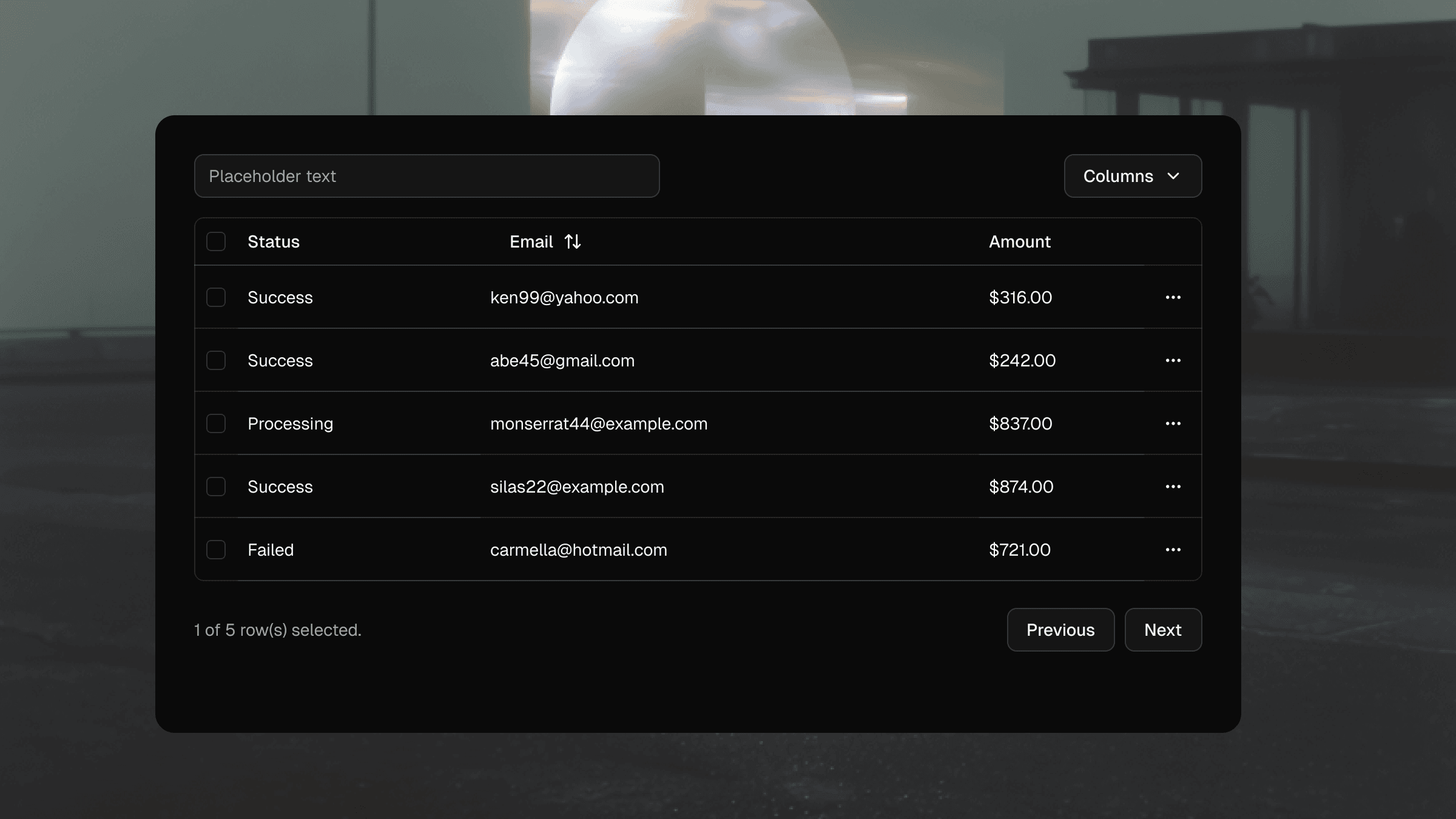
Dashboards and data views
Settings and account screens
Tables, forms, and empty states
Common application layouts and patterns
These components are designed to be used, not just browsed.
Why this is exciting
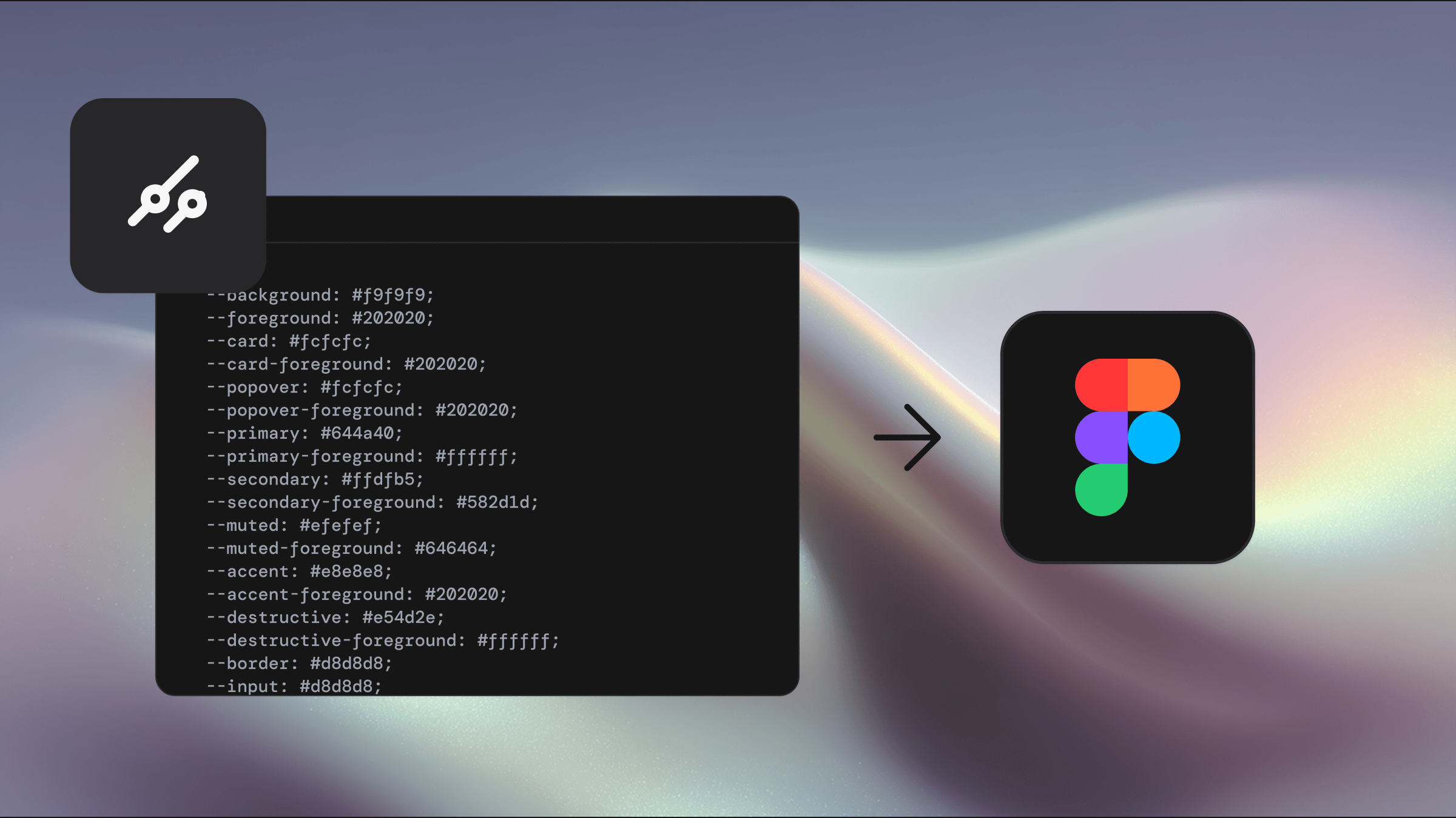
This release unlocks a much wider slice of product UI built on top of shadcn/ui across Pro and Pro React Kits. You can now cover more of your app with consistent, well-thought-through components instead of stitching things together yourself.
And this is just the start
Application components and blocks will continue to grow across both products.
New components will be added regularly
React updates ship weekly as new items hit the registry
More marketing components are coming soon
If you already own the kits, you keep getting the upside.
Grab the update
Everything is live now.
Log into your Polar portal to download the latest files or pull the latest registry updates.
This one’s worth celebrating. More depth, more coverage, and a lot more coming.
Updated Feb 7, 2026
Build faster with shadcn/ui
One-time payment • Lifetime updates
Build faster with shadcn/ui
One-time payment • Lifetime updates
One-time payment • Lifetime updates