Updated Aug 19, 2025
Overview
Speed up your design and development workflow with Shadcraft. A flexible Ul kit built for teams working with shadcn/ui and Tailwind CSS. It includes a full set of production-ready components, patterns, and styles, all mapped to the structure developers expect. Whether you're designing in Figma or handing off to engineering, Shadcraft keeps everything aligned.
What's included
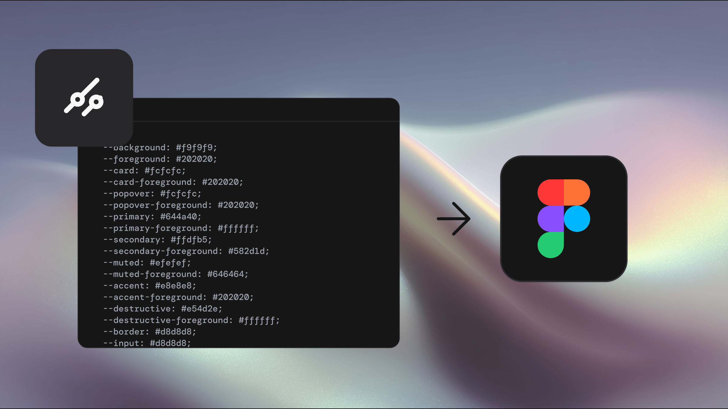
Theme your library instantly with tweakn
All shadcn/ui carefully crafted, production-ready components
Theme support (light and dark modes)
All official shadcn charts
1500+ Lucide icons, organised and ready to go
All shadcn/ui layout-ready blocks to kickstart your next build
Supports multiple brands via theming
All the latest calendar and sidebar blocks
Support
You can get timely support using Shadcraft from our Discord community.
Feature requests
We'd love to hear your ideas on how to improve Shadcraft. Make a feature request.
License
See our licence agreement.
Improve your workflow
Shadcraft was built to speed up the design and development of interfaces that follow the shadn/ui component library. Whether you're working solo or in a cross-functional team, the kit gives you everything you need to create polished, production-ready Uls directly in Figma, without starting from scratch.
How Shadcraft helps you deliver faster
This kit is carefully structured to match the layout, naming, and logic of the official shadon/ui React components. That alignment helps keep design and development in sync, speeding up delivery and reducing back-and-forth.
Key benefits:
One-to-one with code: Components in Figma match what developers will build in code, no more second-guessing spacing, variants, or states.
Cleaner handoff: Shared structure and naming between design and dev make communication easier.
Faster builds: Developers can copy layout and structure straight from Figma, without needing to rebuild components from scratch.
Token-ready styles: The kit uses Figma variables throughout, so themes and dark mode are handled out of the box.
Consistency at scale: Helps maintain a unified experience across screens, platforms, and product teams.
Using Shadcraft saves time, cuts down rework, and gives teams more headroom to focus on product thinking, not layout and spacing.
Keep in the loop
We know many of our licenses are purchased by teams through finance or admin emails - which means designers and developers sometimes miss out on news, updates, and new releases.
Here's how to stay in the loop:
Get the latest on new features and releases at shadcraft.com
Newsletter: Subscribe to updates from Shadcraft to hear about new features and resources
Follow Shadcraft on X: Get real-time updates, tips, and product news straight from the source