Updated Aug 20, 2025
Regular theming
Editing variables
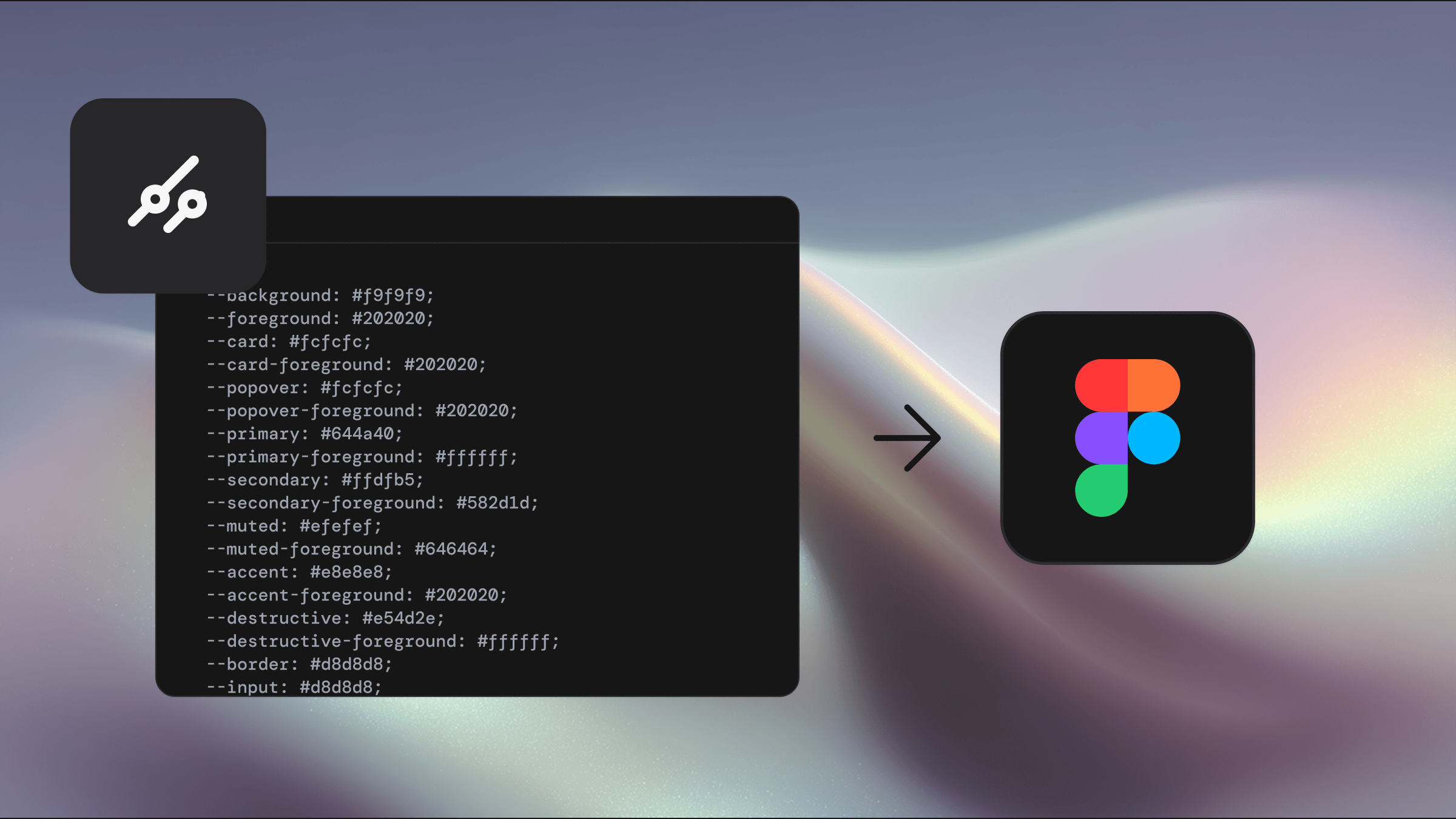
You can quickly update the visual theme of components by editing variables in the Theme collection.
Make sure you have the main Shadcraft library file open — this is the file where all components live and variables are managed.
Change the primary color
To update your primary color (e.g. from Neutral to a custom blue #297EFF):
Open the Variables panel
Switch to the Theme collection
Locate the colors/light/primary variable in the colors group
Enter #297EFF directly in the value field
Repeat the process for colors/dark/primary
Figma will apply the new color across all primary component references
Update neutral colors
You can replace default neutral (grey) colors used in background, border, input, and muted elements with your own colors.
In the Theme collection, locate the relevant neutral variables
Swap out the current values for your own
Changes will cascade across any components that rely on these variables
Using opacity variables
Tailwind lets you apply opacity to colours using syntax like bg-blue-600/90. You can replicate this in Figma using alpha variables.
To apply 90% opacity to a primary color on hover:
Add your primary color as a Fill in Figma
Add a second Fill layer above it
In the color picker, switch to Library
Search for and apply the alpha/90 variable
In code, this would be used as: bg-primary/90
This approach keeps design and development aligned while avoiding the need to create new colors for each opacity level.
Changing the font family
To update your typeface across the system:
Open the Variables panel
Go to the Theme collection
Find the font-sans variable in the font family group
Replace the current value (e.g. Inter) with your preferred font (e.g. Roboto)
Make sure the font name matches exactly with your installed fonts or web font settings.
Adjusting border radius
Border radius plays a big role in the overall feel of your interface. Whether you’re after subtle rounding or bold curves, it’s easy to update system-wide:
Open the Variables panel
Navigate to the Theme collection
Find the radius group
Edit values like
rounded-sm,rounded-md, rounded-lg, andradius-xlto suit your design
Tip: Adjusting other variables like rounded-xs or rounded-2xl will also cascade to related values in the Tailwind CSS collection, keeping things consistent across your UI.
Creating new variables and styles
Creating new variables
Custom variables are supported — just be sure they’re needed. The existing Shadcraft variable sets cover most use cases, and unnecessary additions can bloat your system.
To create a new color variable that follows the established structure:
In the Theme collection, add:
your-variable-light (e.g. warning-light)
your-variable-dark (e.g. warning-dark)
Edit the variables to hide them from publishing
You most likely want to de-scope the variable from all supported properties
In the Mode collection, add:
your-variable referencing the light/dark versions
Adjust the scope to control where the variable applies
Use your new variable in components as needed
Example – Warning color:
warning-light:
#F59E0Bwarning-dark:
#F59E0Bwarning-foreground-light:
#451A03warning-foreground-dark:
#451A03Add warning and warning-foreground to the Mode collection
Apply to UI components where caution or warning states are needed
Use the Figma to shadcn/ui plugin to add matching variables to your codebase
Creating new themes
The Shadcraft variable system supports fast theme switching, ideal for brand variants or accessibility-focused themes.
To create a new theme:
Open the Variables panel
Navigate to the Theme collection
Click the ”+” icon in the top right to create a new mode
Rename the new mode (e.g. Brand B, High Contrast)
Adjust values to match your brand or visual preferences
You can now toggle between complete themes while keeping all components intact.
To use multiple modes, your file must be part of a Figma Professional or Enterprise team or org.
Working with styles
Figma Styles (typography and effects) mirror Tailwind’s utility classes and are powered by variables from the Theme collection.
Adding a new text style (example: Heading)
Use the Text tool to create some text
From the design panel, apply these variables:
Font family:
font-sansSize:
text-4xlWeight:
weight/font-extraboldLine height:
line-height/leading-10
Click the Apply styles icon
Click the + icon
Give the style a meaningful name like text-4xl
Click Create style
Move the style into the relevant style group
Developers can now apply the style in code using Tailwind classes like:
This keeps visual language consistent from design to dev.
Dark mode support
One of the most powerful features of variables in Shadcraft is the built-in support for light and dark modes — with no need to duplicate layouts or rebuild anything.
How it works
The Theme collection includes predefined values for both light and dark color modes. Switching between them updates your entire file instantly.
How to switch modes:
Select a page or frame
In the Layer panel, look for the “Apply variable mode” icon
Click to open the dropdown menu
Select either Mode → Light or Mode → Dark
Your selection will now adapt to the chosen theme.
Multi-brand systems
To support multiple brands, create additional modes in the Theme collection.
Open the Local Variables panel
Select the Theme collection
Click “+” in the top bar of the variable table
Rename the new mode (e.g. Brand A)
Update variable values to reflect the brand’s color, spacing, and font styles
How to apply a brand theme:
Select a page or frame
In the Layer panel, look for the “Apply variable mode” icon
Select Theme → Brand A to apply the new style