Documentation
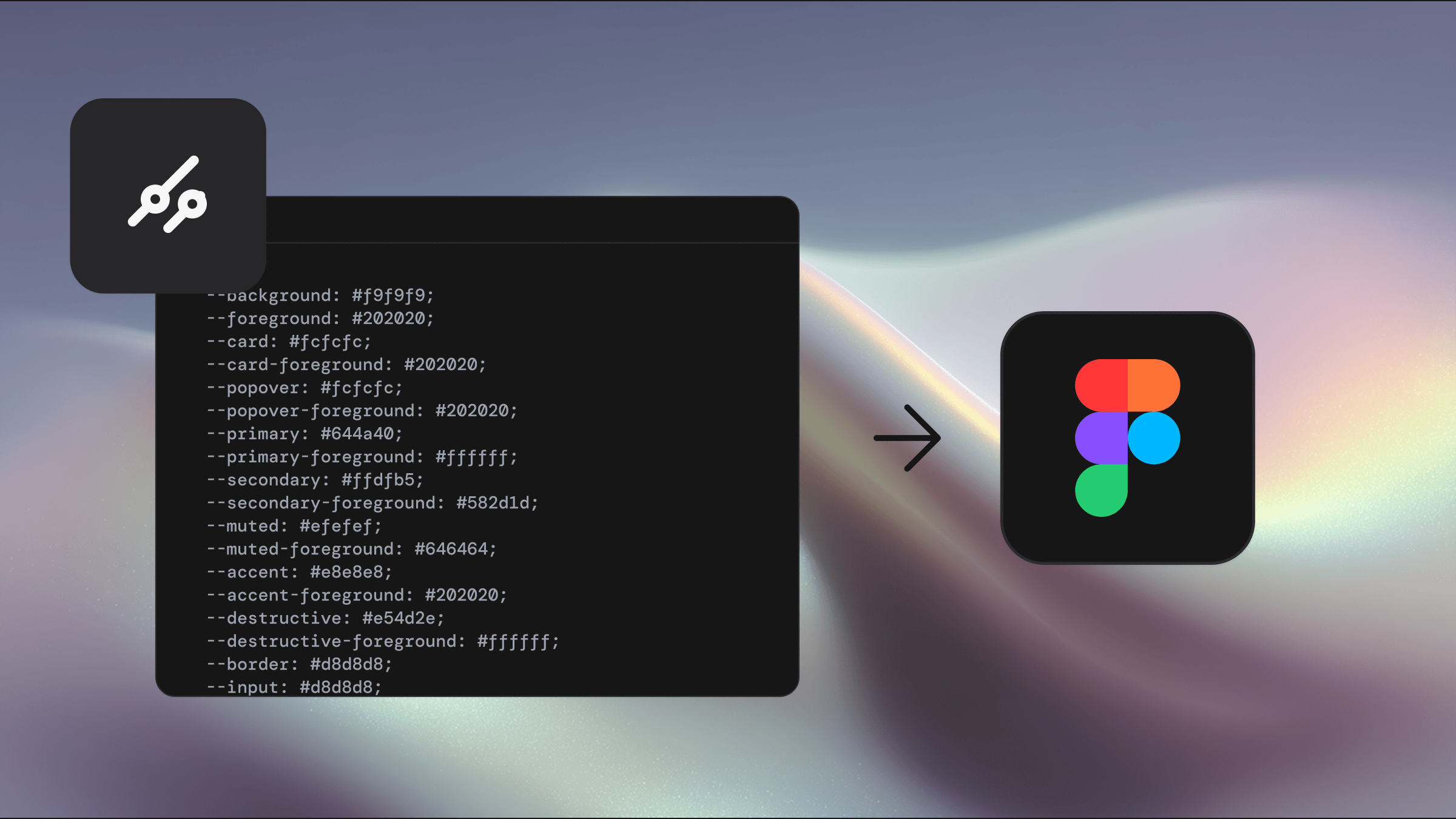
Welcome to the documentation for the Figma UI kit. Here you’ll find everything you need to get started, from setting up variables and themes to working with components and icons. Whether you’re exploring instant theming with tweakcn, applying regular theming, or checking the latest updates, these guides will help you design faster and stay aligned with your team.


Pricing
Upgrade anytime. Pay only the difference between products.
Select license
Single
Team
Enterprise
For solo designers and developers
Fast support • Unlimited projects • Lifetime updates
Base
All official shadcn/ui components and blocks in Figma. Everything you need to start designing with a strong foundation.
Easy theming via our plugin
All shadcn components
All shadcn blocks
All 5 complete icon sets
Tailwind CSS alignment
Prototype interactions
Figma variables
Light & dark mode
Pro
Pro Components, Blocks, and Templates. A complete Figma UI Kit that lets you assemble polished layouts in seconds.
Everything in Base
42+ Pro Components
132+ Blocks to ship faster
Full page Templates
Perfect for marketing sites
Ideal for product apps [New]
Assemble sites in seconds
Responsive layouts
+
Pro React
Pro Figma UI Kit plus matching React components. Build production-ready interfaces with aligned design and code.
Everything in Pro
Pixel perfect design parity
Zero setup needed
Composable / extendible
Production ready blocks
Fully responsive
shadcn aligned tokens
CLI install & MCP support
Prices in USD.
Secure payment with Polar.sh
+
Free
Looking for a free option?
Access a curated set of shadcn components in the Figma community library, try tweakcn theming, and use the free Shadcraft registry. A simple way to trial the kit before upgrading.


Stay in the know
Keep updated on all things happening with Shadcraft.
We respect your privacy
Stay in the know
Keep updated on all things happening with Shadcraft.
We respect your privacy
Stay in the know
Keep updated on all things happening with Shadcraft.
We respect your privacy