Shadcraft
Dec 9, 2025
This guide walks through the principles, patterns and decisions that lead to stable, maintainable tables that scale with your product. Whether your focus is code, design or both, these best practices will help you avoid the usual pitfalls.
Why tables are difficult
Tables carry unique challenges because they combine layout, semantics, interaction and large volumes of data.
They must remain readable at all sizes.
They often support custom interactions.
They require strong alignment rules.
They need predictable column behaviour.
They must stay responsive without breaking structure.
They must be accessible to keyboard and screen reader users.
shadcn/ui gives you the primitives, but it is your job to apply structure, UX thinking and production ready logic.
Start with the right table structure
Tables should begin with semantic markup that reflects their purpose.
This structure is the anchor for responsiveness, accessibility and consistent styling.
Keep column meaning clear
Each column should represent a single type of information. Do not mix data types or place unrelated content inside a single cell.
Avoid over nesting
Complex wrappers inside cells make alignment harder and increase cognitive load. Place only what you need inside each cell and use utility classes for spacing.
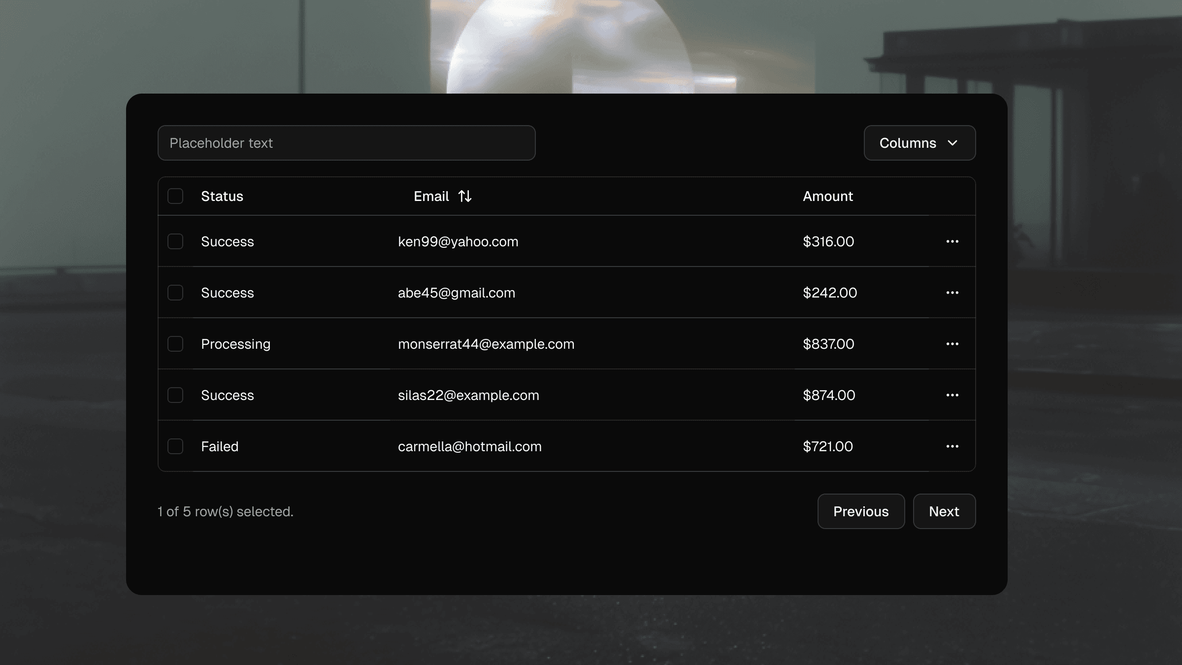
Handling alignment and density
Column alignment
Follow these patterns:
Left align text based content.
Right align numbers, prices and metrics.
Centre align status badges only when it improves scanning.
Mixing alignment across rows creates visual noise and reduces readability.
Vertical density
Tables should feel compact without becoming cramped. Define clear spacing tokens and apply them consistently across rows. Avoid ad hoc padding for edge cases.
Your Shadcraft Figma kit includes table row variants with correct spacing baked in so designers and developers stay aligned.
Sorting & pagination
Most production tables need interaction. Keep these principles in mind.
Sorting
Sorting indicators should follow a consistent pattern.
Neutral state when unsorted.
Clear up and down icons when active.
Icons only visible on hover for dense tables if space is limited.
Sort icons must be announced correctly to screen readers.
Pagination
For large datasets, server side pagination is more performant. Avoid infinite scroll as it disrupts context and makes navigation difficult for keyboard users.
Action cells and patterns
Tables often contain row level actions such as:
edit
delete
view
open menu
Keep actions in a consistent column. Use icons only when the meaning is unambiguous, otherwise pair icons with text.
For complex action sets, use a dropdown menu to declutter the table and reduce accidental taps on mobile.
Accessibility considerations
Accessible tables require semantic structure plus keyboard and screen reader support.
Correct roles
The default shadcn/ui table components map to correct HTML semantics, so do not override roles unless absolutely necessary.
Table headers and scope
Use <TableHead> for headers and ensure each header has the correct scope so screen readers can map headers to cells.
Keyboard navigation
Users should be able to:
Tab through interactive elements in cells.
Operate sort and filter controls by keyboard.
Navigate pagination components.
Avoid placing non interactive elements in the tab order.
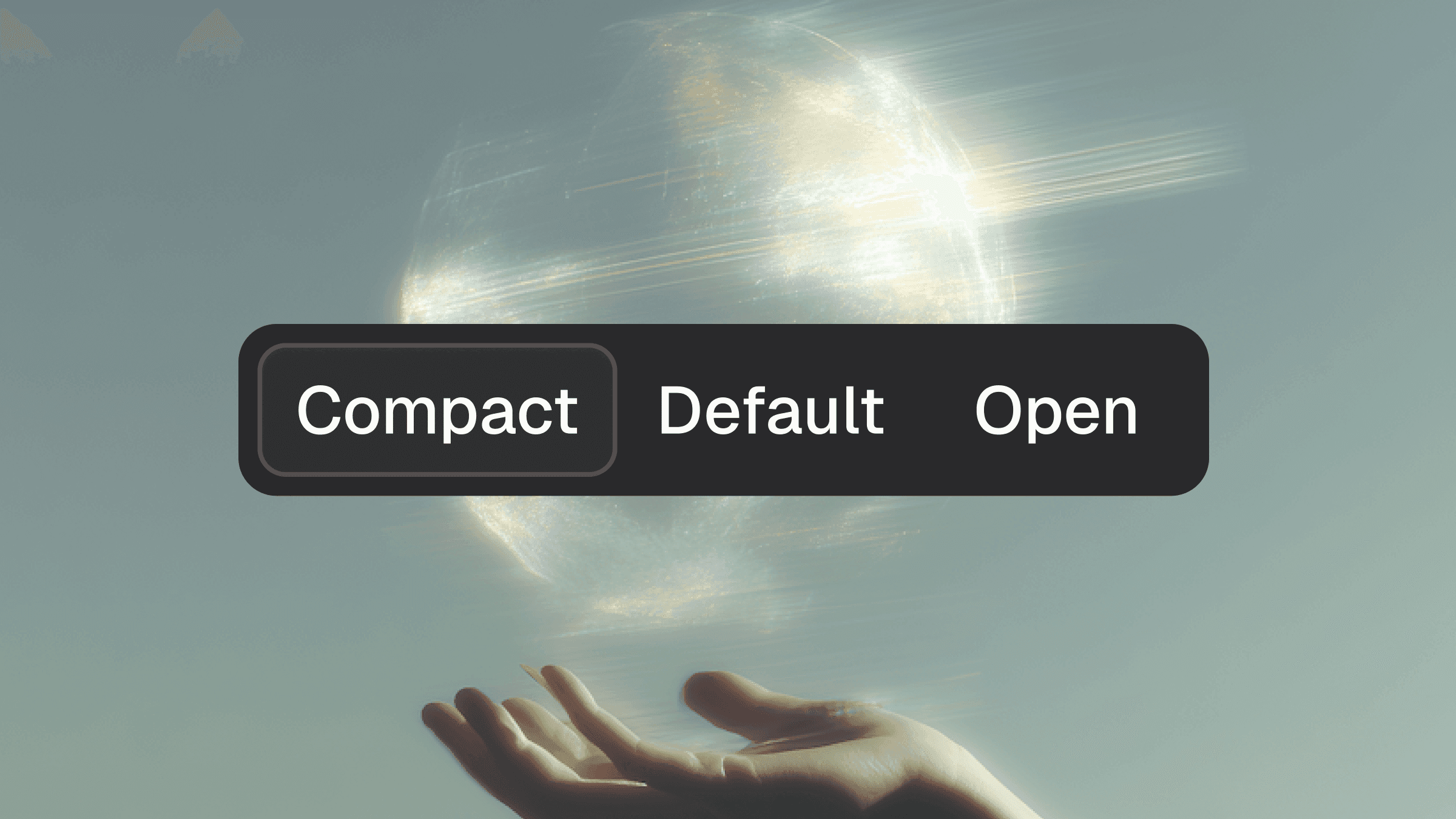
Responsiveness
Tables do not naturally scale down to mobile, so you need a clear strategy.
Option 1. Hide non essential columns
Keep primary identifiers visible and hide secondary data at small breakpoints.
Option 2. Convert each row into a stacked card
This removes the grid but improves readability on narrow screens.
Option 3. Horizontal scroll
Use sparingly. Ensure the scroll area has clear affordances.
Your design team should choose one responsive pattern and stick to it across the entire product.
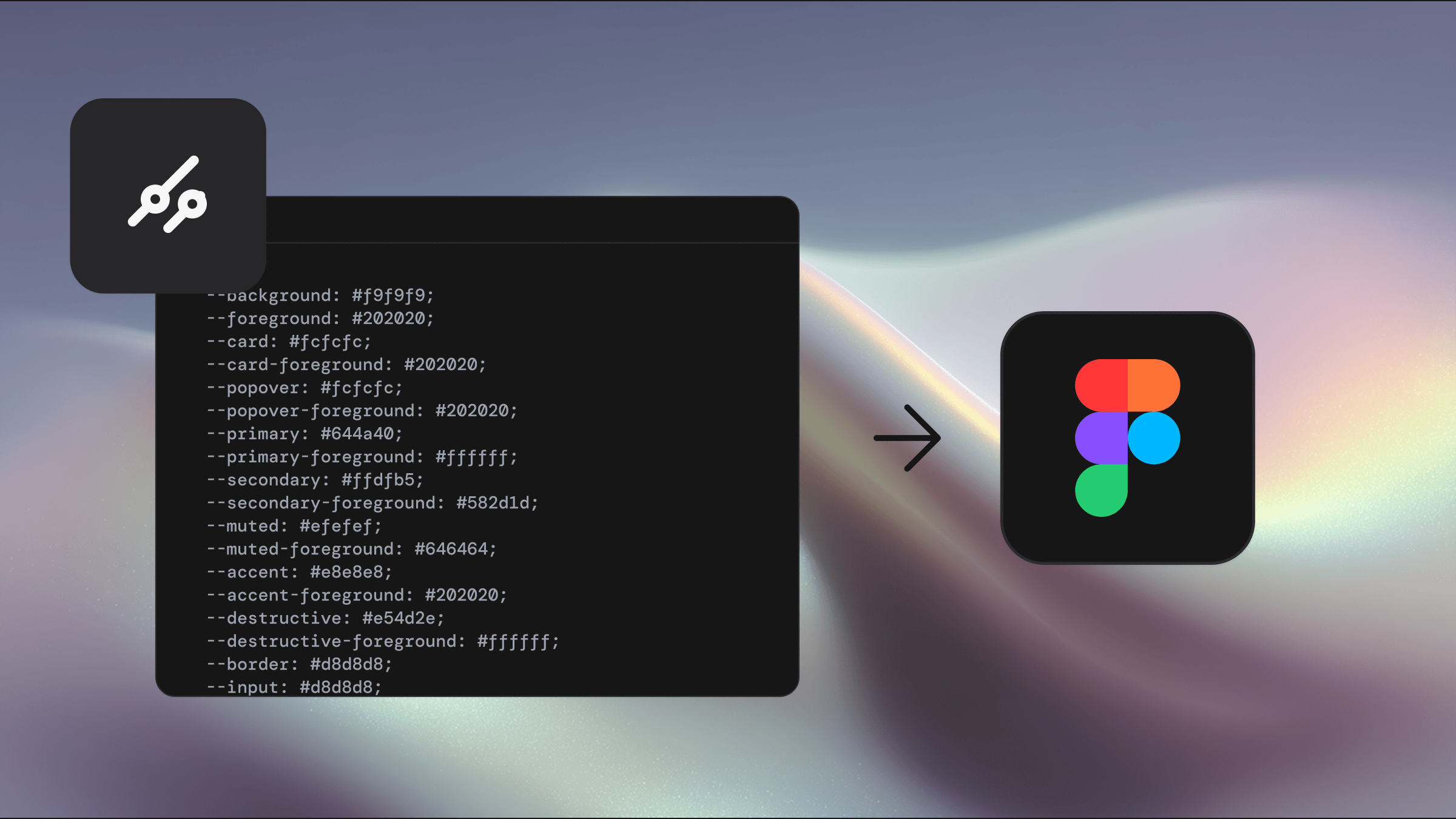
Theming your table
shadcn/ui supports theming through Tailwind tokens and CSS variables. This gives you control over:
header background
row hover colour
border style and density
zebra striping
status colour tokens
typography and spacing
With structure defined and tokens managed correctly, theme updates apply across the entire table with no component rewrites.
Shadcraft’s kits include proper variable support so designers can preview light, dark and brand themes instantly. This is a major time saver for data heavy products.
Performance considerations
Tables often load thousands of rows. Keep the following in mind.
Use virtualisation for very large datasets.
Memoize row components to avoid unnecessary re renders.
Keep cell logic simple and avoid expensive operations inside render loops.
Offload heavy sorting and filtering to the server when possible.
Performance should be tested with production scale data, not small demo sets.
Production checklist
A reliable shadcn/ui table should pass this checklist.
Semantic table structure
Clear column alignment rules
Strong visual hierarchy for headers and rows
Accessible sort controls and labels
Responsive behaviour that matches product needs
Consistent density and spacing
Stable theming across light and dark modes
Predictable keyboard interactions
Optimised for performance
Maintained through tokens rather than ad hoc overrides
How Shadcraft helps teams design better tables
The Shadcraft Figma kits include fully structured table components that match the markup used in shadcn/ui. This gives designers:
accurate columns, cells and row variants
consistent density across all table types
prebuilt patterns for sortable and interactive tables
instant theming support through variables
pixel perfect spacing that aligns to the codebase
This removes the guesswork and speeds up design to development workflows, especially in enterprise or data heavy products.
Final thoughts
Tables are challenging, but shadcn/ui provides a solid foundation that becomes powerful when paired with clear UX rules, accessible patterns and theme driven styling. With the right structure in place, your tables become predictable, scalable and easy to maintain, even as your product grows.
If you want a Figma kit that matches the shadcn/ui code exactly and includes production ready table patterns, the Shadcraft Base and Pro kits offer a fast, reliable starting point.
Updated Dec 9, 2025