Shadcraft
Dec 9, 2025
This guide covers the best practices for designing and building tabs in shadcn/ui, from UX principles to keyboard interactions and theming. If you are working across both Figma and React, these patterns will help you produce consistent, reliable interfaces.
Why tabs matter
Tabs help users organise information and move between views with minimal friction. They are often used for:
switching between datasets
toggling different content states
navigating secondary page areas
exposing advanced settings without cluttering the layout
Good tabs feel effortless. Poorly structured tabs confuse users and hide important content. shadcn/ui gives you a strong foundation, but you still need to apply clear design and UX thinking.
UX principles for tabs
Keep tab labels short and scannable
Users should understand each option at a glance. Aim for one or two words. Avoid long sentences and avoid wrapping labels onto multiple lines.
Good examples:
Overview, Activity, Settings, Billing
Poor examples:
Account configuration details, Things you might want to adjust
Use tabs only when content is related
Tabs should represent different views of a single concept. If switching tabs feels like switching sections of the product, you probably need a different pattern such as a sidebar or stepper.
Maintain stable layout
Content under each tab should feel structurally similar. Avoid huge jumps in height or layout shifts. Users should not feel like they are being taken to a completely different part of the interface.
Keep the active tab visually clear
Users should always know which tab is selected. Use clear visual cues such as:
increased font weight
a strong underline or indicator
theme driven colour highlights
Accessibility best practices
Tabs in shadcn/ui inherit Radix accessibility features, but you are still responsible for correct content structure.
Use semantic markup
The TabList wraps the triggers.
Each TabTrigger controls one TabContent panel.
TabContent panels should include role="tabpanel" and be programmatically linked to their triggers.
The shadcn/ui components handle this automatically if used as intended.
Ensure readable labels
Screen readers announce tab labels, so avoid icons alone or ambiguous names. If icons are required, pair them with text.
Preserve focus visibility
Users navigating by keyboard should see exactly where focus is. Do not override focus states with custom styles that remove the outline or indicator.
Keyboard behaviour in shadcn/u
Keyboard support is a core part of Radix and shadcn/ui. Make sure your implementation preserves these interactions.
Arrow keys move focus between tabs horizontally.
Home jumps to the first tab.
End jumps to the last tab.
Enter or Space activates a focused tab.
Tab moves focus out of the tablist entirely.
If you override components or restructure markup, verify that keyboard behaviour still works as expected.
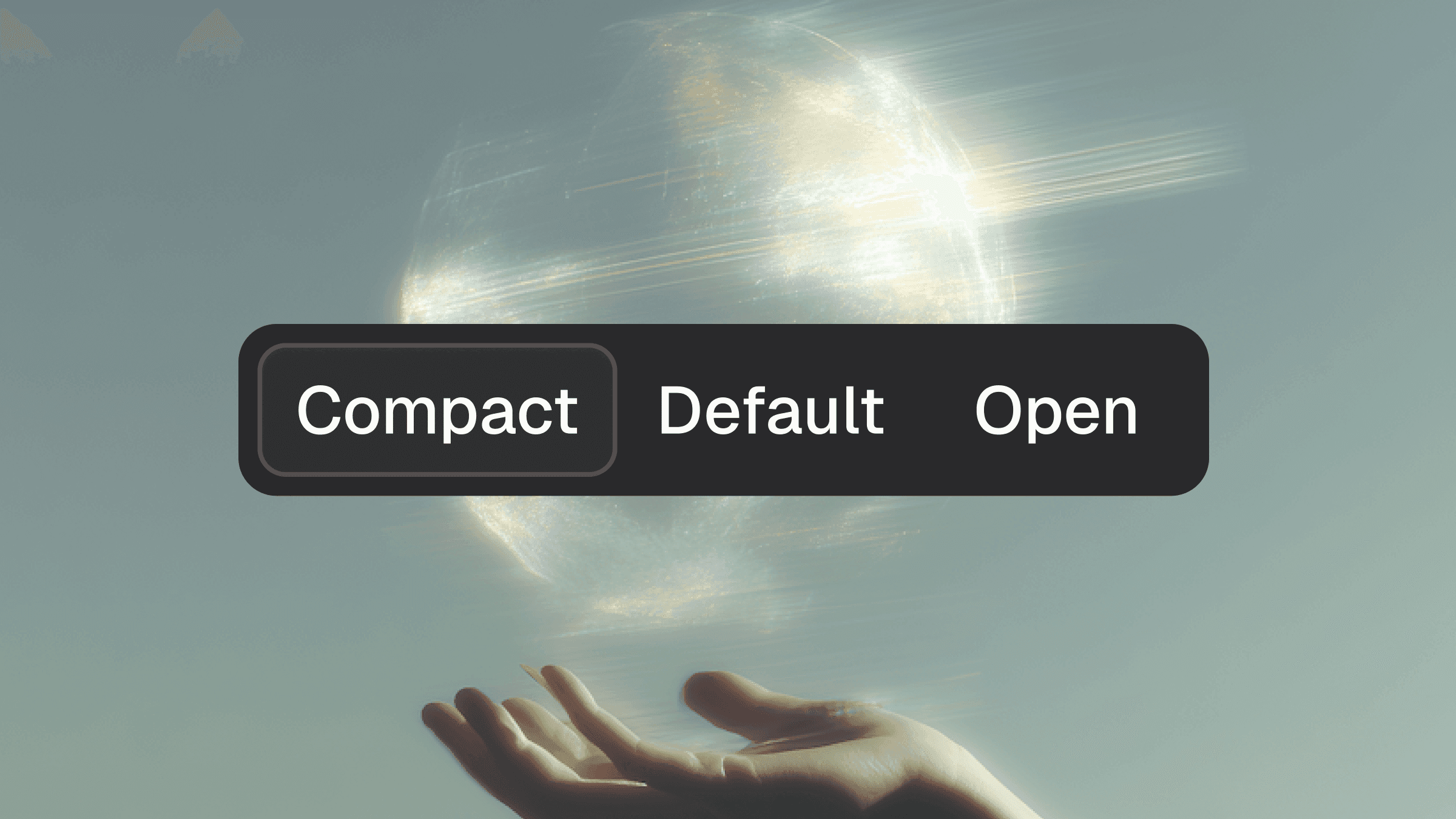
Handling variants
shadcn/ui supports a simple visual variant and gives you the freedom to introduce your own.
Segmented tabs
These mimic segmented controls and feel closer to a toggle group. Use them when switching between modes rather than pages of content.
When to create custom variants
Create a new variant only when it adds clarity, not when it adds novelty. Every additional variant increases cognitive load for users and designers.
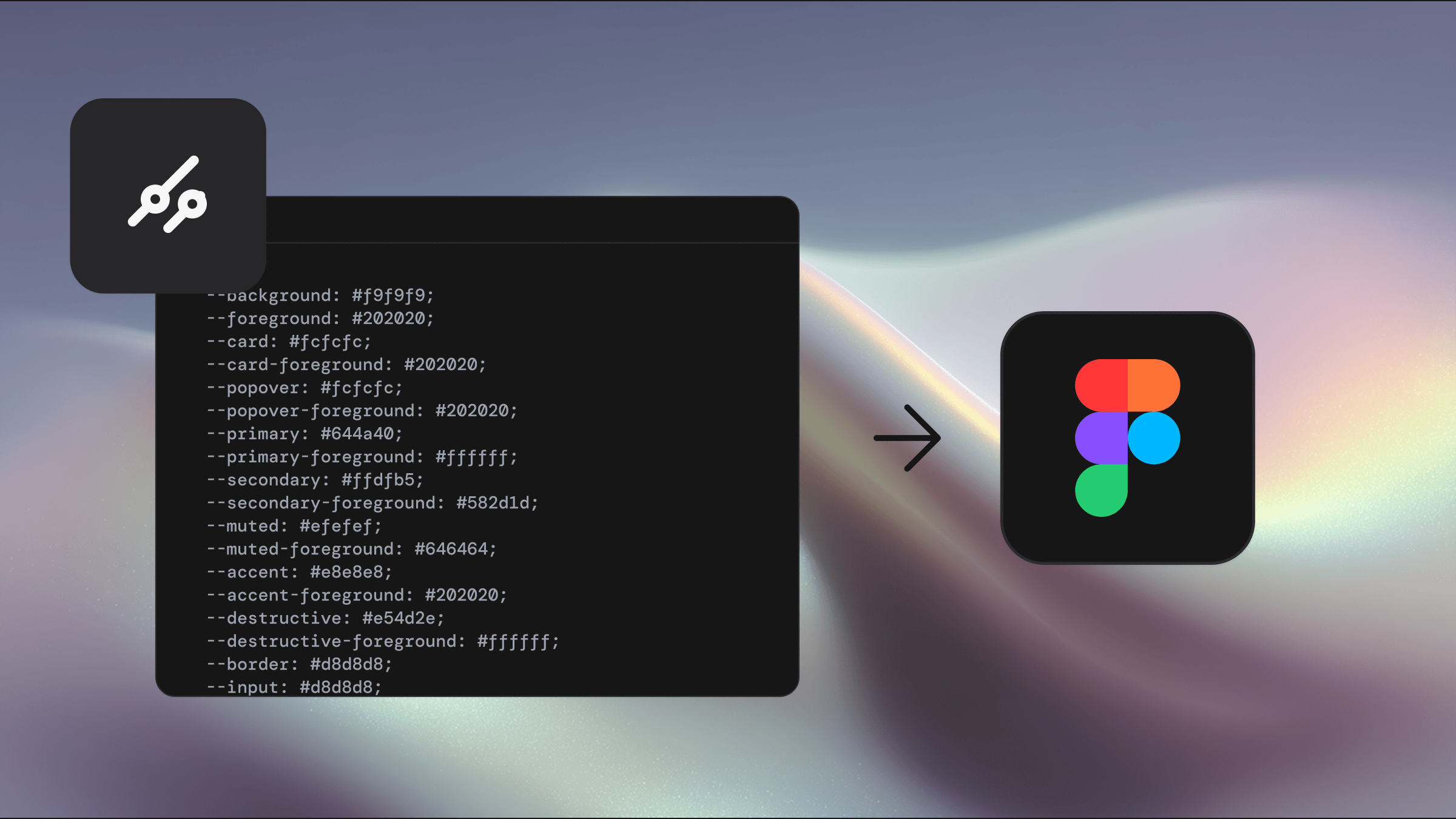
Your Shadcraft Figma kit includes all standard variants with pixel perfect alignment to the codebase. This prevents drift and makes it easier for teams to work consistently across screens.
Theming your tabs
With shadcn/ui, theming is controlled through Tailwind tokens. That means your tabs can adapt instantly when you change your theme or brand layer.
Colour choices
Reserve your strongest colour token for the active indicator or pill background. Keep inactive tabs low contrast so the hierarchy stays clear.
Spacing and touch targets
Follow accessible touch target sizes. The indicator area does not count as part of the touch target, so make sure the trigger itself is large enough.
Dark mode alignment
Check:
indicator contrast
label clarity
hover and focus states
inactive tab visibility
Your Figma kit and tweakcn integration make it possible to test all variants in light and dark mode instantly, which speeds up this part of the workflow.
When tabs are not the right choice
Avoid tabs when:
you have more than six options
your content is unrelated
users need to complete a step by step process
navigation requires deep hierarchy
the mobile layout becomes cramped
In these cases, consider accordions, side navigation or a multi step flow instead.
Best practice example
A strong tabbed interface in shadcn/ui should follow this checklist.
Clear labels that describe the destination
Consistent width, structure and spacing
High contrast active state
Smooth keyboard navigation
Stable layout when switching content
Responsiveness across breakpoints
Themed colours that suit light and dark mode
Accessible roles and ARIA links applied automatically by the component
How Shadcraft helps you design better tabs
Designing tabs from scratch in Figma can be time consuming and often leads to mismatches with the actual shadcn/ui code. The Shadcraft Base and Pro kits include:
Figma components that mirror every code variant
Proper states and indicators
Auto layout structures that match production markup
Theming support through variables for instant brand alignment
Block level patterns so tabs feel native across full screens
This keeps designers aligned with developers and prevents the usual drift between Figma and React.
Final thoughts
Tabs are simple on the surface, yet they carry a surprising amount of UX, accessibility and structural complexity. shadcn/ui handles the heavy lifting for behaviour and accessibility, but it is up to you to apply thoughtful design, clear labelling and consistent theming.
When done well, tabs keep your interface organised, predictable and easy to navigate. With the right foundations in Figma and code, they become one of the most dependable patterns in your product.
If you want a ready to use set of tab components that match the shadcn/ui codebase out of the box, the Shadcraft Figma kits provide a fast and accurate starting point.
Updated Dec 9, 2025