Shadcraft
Dec 8, 2025

What is shadcn/ui?
shadcn/ui is a library of copy-and-paste components built with React, Tailwind CSS and Radix primitives. Unlike traditional UI libraries that ship as a package, shadcn/ui gives you the actual source code for every component. You install what you need and own the code from that point on.
This approach has a few important outcomes.
You can modify anything.
Your bundle stays small because you only include components you use.
You get predictable styling because everything is powered by Tailwind.
You are not locked into an external API that might change.
It’s a library that behaves like a starting point rather than a strict framework, which is why developers like it so much.
Why it became popular
The rise of shadcn/ui happened quickly for a reason. It solves real pain for real teams.
It avoids the rigidity of classic component libraries
Most UI kits force you into their styling layer or component API. shadcn/ui hands you the source code and lets you extend, refactor or restructure whenever required.
It pairs perfectly with Tailwind and Radix
Tailwind handles styling through utility classes. Radix handles accessible behaviour and interactions. shadcn/ui wraps them together into production-ready components so you don’t have to build everything from scratch.
It matches how teams already work
Copy the component. Drop it into your project. Adjust to fit your brand. Commit. Done.
The workflow matches common engineering habits, which has helped adoption spread quickly.
It is easy to reason about
Because the code is transparent, developers can see exactly how each component works. This reduces debugging time and improves long term maintainability.
What you get out of the box
The library includes all the common interface building blocks your app needs.
Buttons
Inputs and forms
Menus and dropdowns
Tabs, accordions and navigation
Dialogs, sheets and overlays
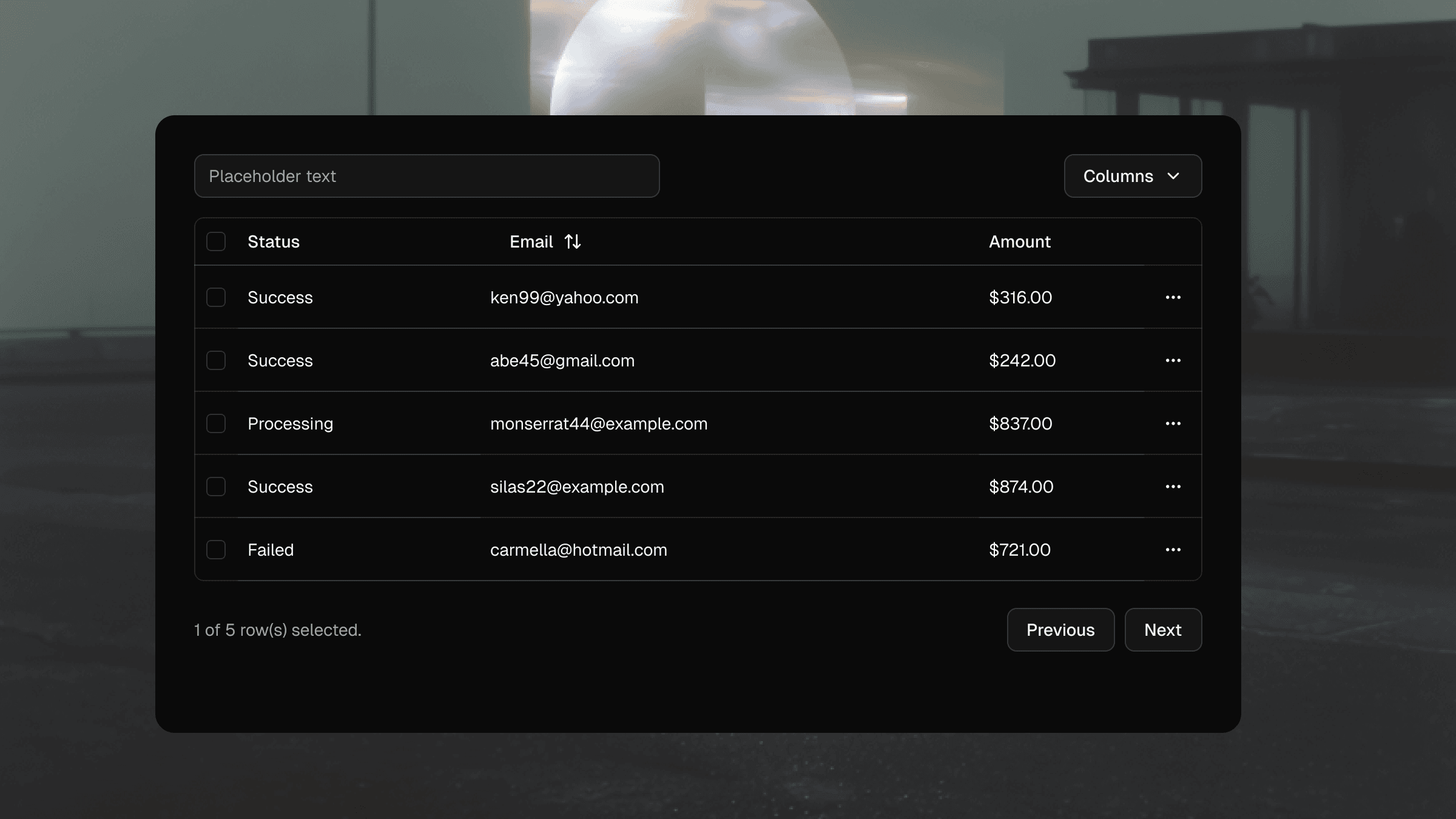
Tables and data displays
Avatars, badges, cards and utility components
Each one includes sensible defaults and supports dark mode, responsive variants and deep customisation.
How teams use shadcn/ui in real projects
Although every team adapts it differently, a few patterns have emerged across engineering and design teams.
Start with the defaults, then theme
Teams begin by installing the standard components and using Tailwind tokens for colour, spacing and typography. Once the foundation is stable, they apply branding and theme overrides to make the system feel like their own.
Extend components for product specific needs
Because everything is local code, teams can add variants, restructure markup or integrate business logic as required. This keeps the system flexible across large product surfaces.
Use it as the base layer of a design system
Many teams start with shadcn/ui before formalising their own design system. It gives them a consistent foundation and a reliable set of patterns while they mature their product.
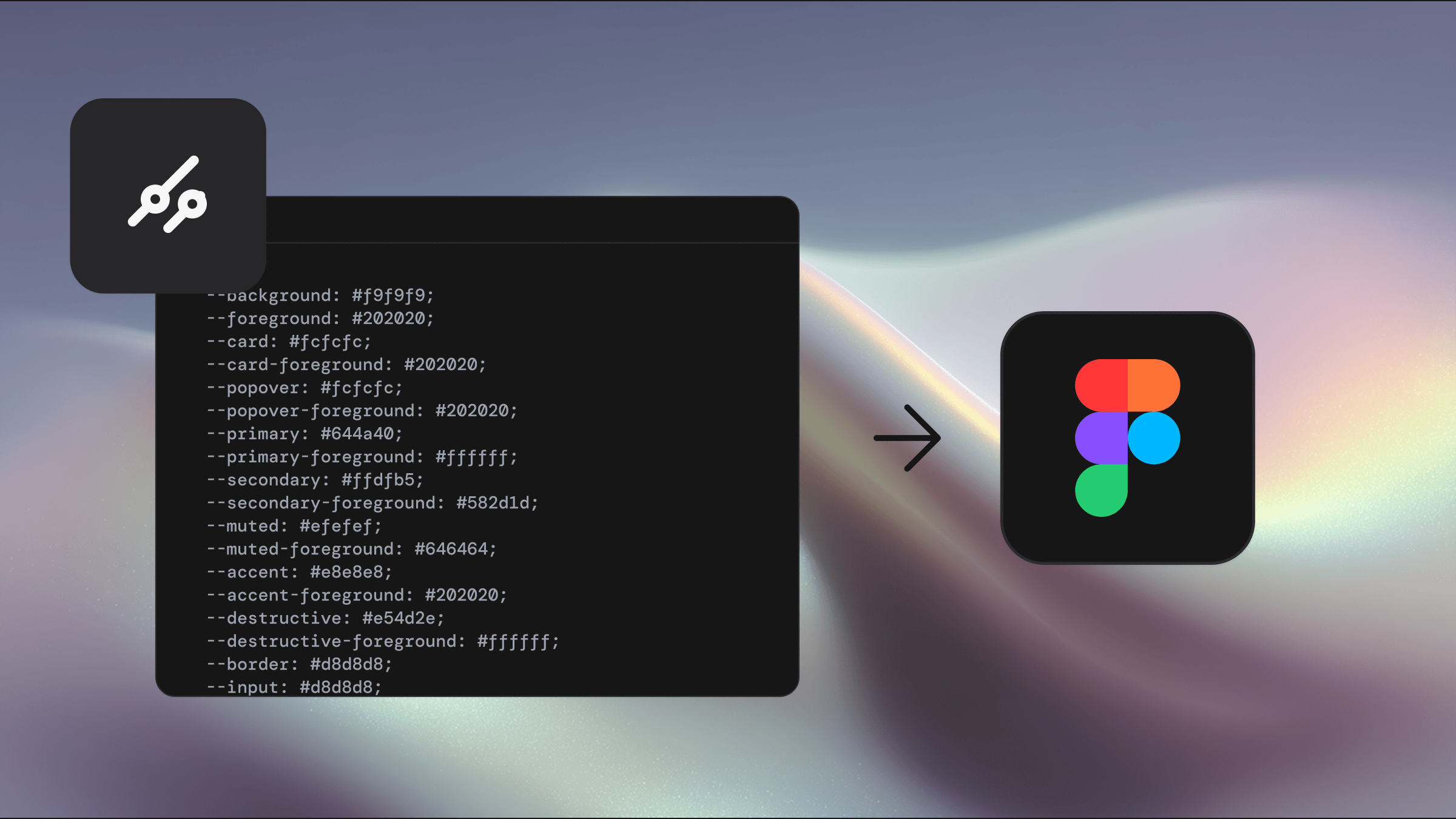
Pair it with Figma kits for design alignment
Designers often mirror the shadcn/ui structure in Figma so the engineering and design layers match. This alignment reduces handoff issues and improves speed across both disciplines.
Where shadcn/ui falls short for designers
While the codebase is clean and modular, the Figma experience can be fragmented if you’re building everything from scratch. Designers often run into:
inconsistent component structures
missing variants
mismatched spacing
difficulty rapid theming across colours or brands
alignment problems between design and code
This is where Shadcraft enters the picture.
A faster way to start: the Shadcraft Figma kits
Shadcraft offers Figma UI kits built specifically for shadcn/ui. They mirror the codebase so designers and developers stay aligned, and they include advanced features that make real product work faster.
Benefits for beginners and teams
Components match production shadcn/ui structure
All variants are included and logically grouped
Instant theming with tweakcn and Figma variables
Blocks and patterns for real app screens
Pixel perfect spacing for consistent design output
Instead of building everything by hand, teams can start with a complete, scalable foundation. Designers get clarity. Developers get fidelity. Everyone moves faster.
Should you adopt shadcn/ui?
If you want a modern, flexible and transparent component stack for React, shadcn/ui is an excellent choice. It is lightweight, easy to customise and widely supported across the community. It works for solo developers building their next SaaS, and it scales well for larger product teams with formal design systems.
Pairing it with a structured Figma kit removes the usual design bottlenecks and lets you focus on the product experience rather than rebuilding components.
Final thoughts
shadcn/ui continues to grow because it strikes the balance between flexibility and structure. It lets teams own their components without starting from an empty file, and it fits naturally into modern workflows for both code and design. With the help of a well-crafted Figma kit, you get the best of both worlds: speed and consistency.
If you’re starting a new project or refreshing an existing one, shadcn/ui is one of the strongest foundations you can choose.
Updated Dec 9, 2025