Shadcraft
Dec 8, 2025
Figma Code Connect tackles that problem by linking your Figma components directly to the files and exports they reference in your codebase. Instead of developers or AI tools guessing how something should be built, they get the exact component name, path, and props your team uses in production.
The Shadcraft shadcn/ui kit is shaped specifically for this workflow. It mirrors shadcn/ui’s real structure, includes rich variants and properties, and uses a variable system aligned with Tailwind tokens. This guide explains how to set it up using the visual Code Connect UI inside Figma. If your engineering team prefers the CLI workflow, follow the official Figma docs.
Can the Shadcraft shadcn/ui kit work with Code Connect?
Yes. The kit is designed with Code Connect usage in mind, and it integrates smoothly because:
Component structure follows real code
Each component aligns with the shadcn/ui folder structure and naming patterns developers actually use.
Variants map directly to props
Variant sets in Figma mirror common prop values in React, which creates a clean handoff.
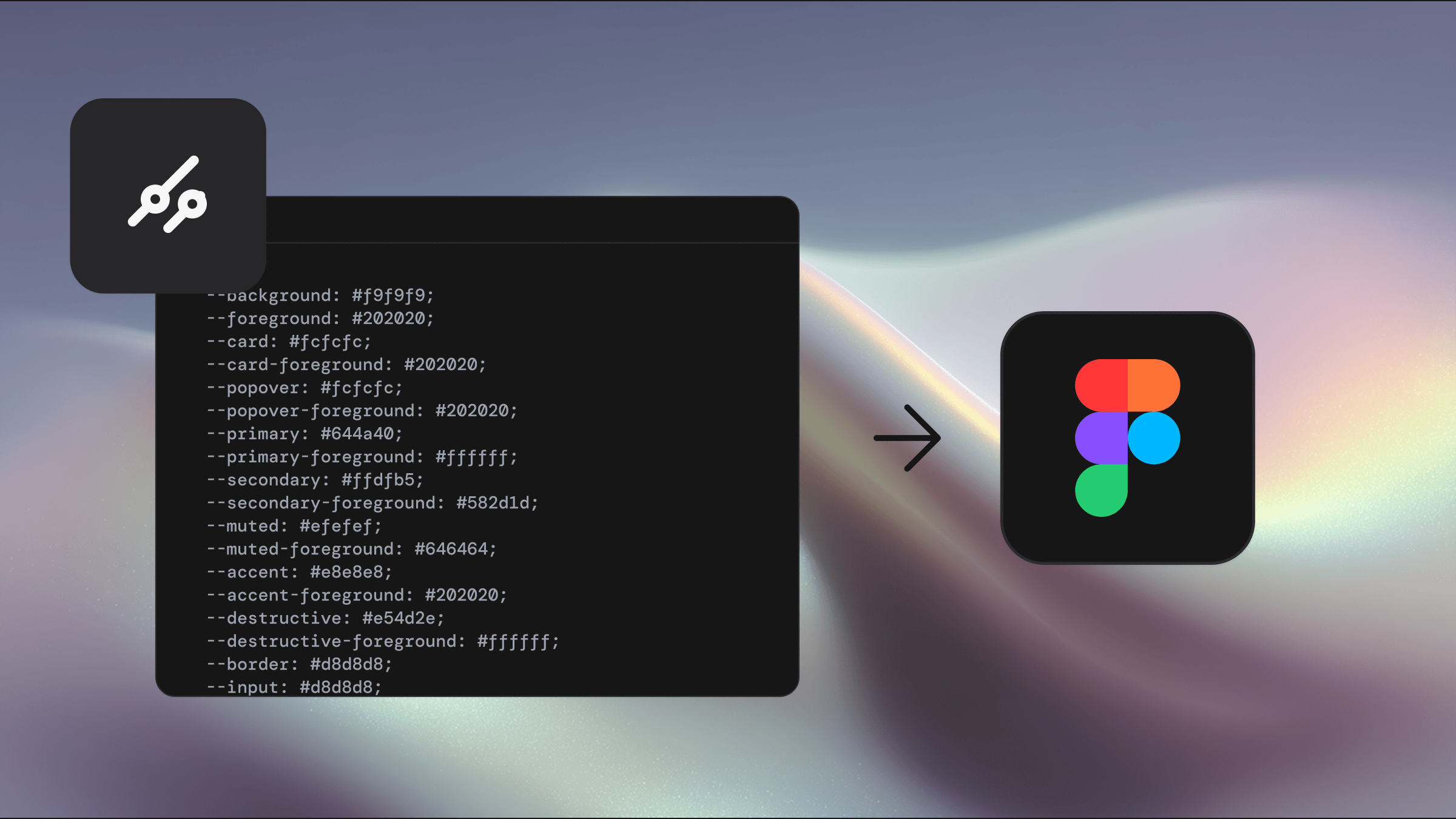
Variables match Tailwind tokens
Colours, radii, spacing, and type scales use Figma Variables that reflect the same tokens your Tailwind config exposes.
Familiar component hierarchy
The kit’s structure closely follows the components/ui pattern found in shadcn/ui repos.
This makes both the UI-based and CLI-based Code Connect workflows straightforward.
What Code Connect does
Code Connect builds a link between Figma components and their coded implementation. Once configured:
Dev Mode shows real code snippets from your repository
AI tools can reference your exact component files and prop types
Developers get production-aligned examples instead of generic samples
When paired with the MCP server, Code Connect allows AI tools to interpret your layouts with much deeper context.
Why this matters for shadcn/ui teams
shadcn/ui operates on an ownership model where teams copy components into their project and maintain them. This flexibility only works when design and code stay aligned.
Code Connect ensures your Figma kit reflects your repo structure precisely. Designers work with components that match what developers use. Developers get accurate references. AI tools build from the actual implementation patterns in your project.
Why the Shadcraft kit is ideal for Code Connect
A full component set
The kit includes thousands of components and states built with proper Figma Variants and Component Properties that match the real API.
Variables-driven design
The variable sets mimic Tailwind’s token structure, giving Code Connect meaningful token-level insight.
Folder structure parity
Buttons, Cards, Inputs, Dialogs and more share the same structure as a typical shadcn/ui codebase.
Real behaviour and layout
Auto Layout and properties reveal intent, helping Code Connect understand how components adapt or respond.
Multi-brand support
Variable sets make it easy to swap brands or themes, and Code Connect respects whichever set is active.
Using Code Connect UI in Figma
This approach suits designers or teams who want a visual setup process without using the CLI.
Before you start
Code Connect requires a Figma Organization or Enterprise plan.
Step 1: Open the Shadcraft kit
Either work directly inside the kit or ensure it’s published as a library. You’ll map components from this source.
Step 2: Switch to Dev Mode
In the file using kit components:
Select an instance
Enter Dev Mode
Locate the Code Connect panel on the right
If you don’t see it, an admin may need to enable it.
Step 3: Connect GitHub (optional)
If you prefer automatic matching:
Authorise Figma
Choose your repository
Let Figma attempt to detect components
This is optional; manual mapping gives you full control.
Step 4: Map components manually
For most shadcn/ui setups, manual mapping is fast and accurate.
Common paths look like:
Select an instance, open the Code Connect panel, and add:
File path
Exported component name
Repository URL (optional)
Step 5: Quick reference mappings
Component name | Code path |
|---|---|
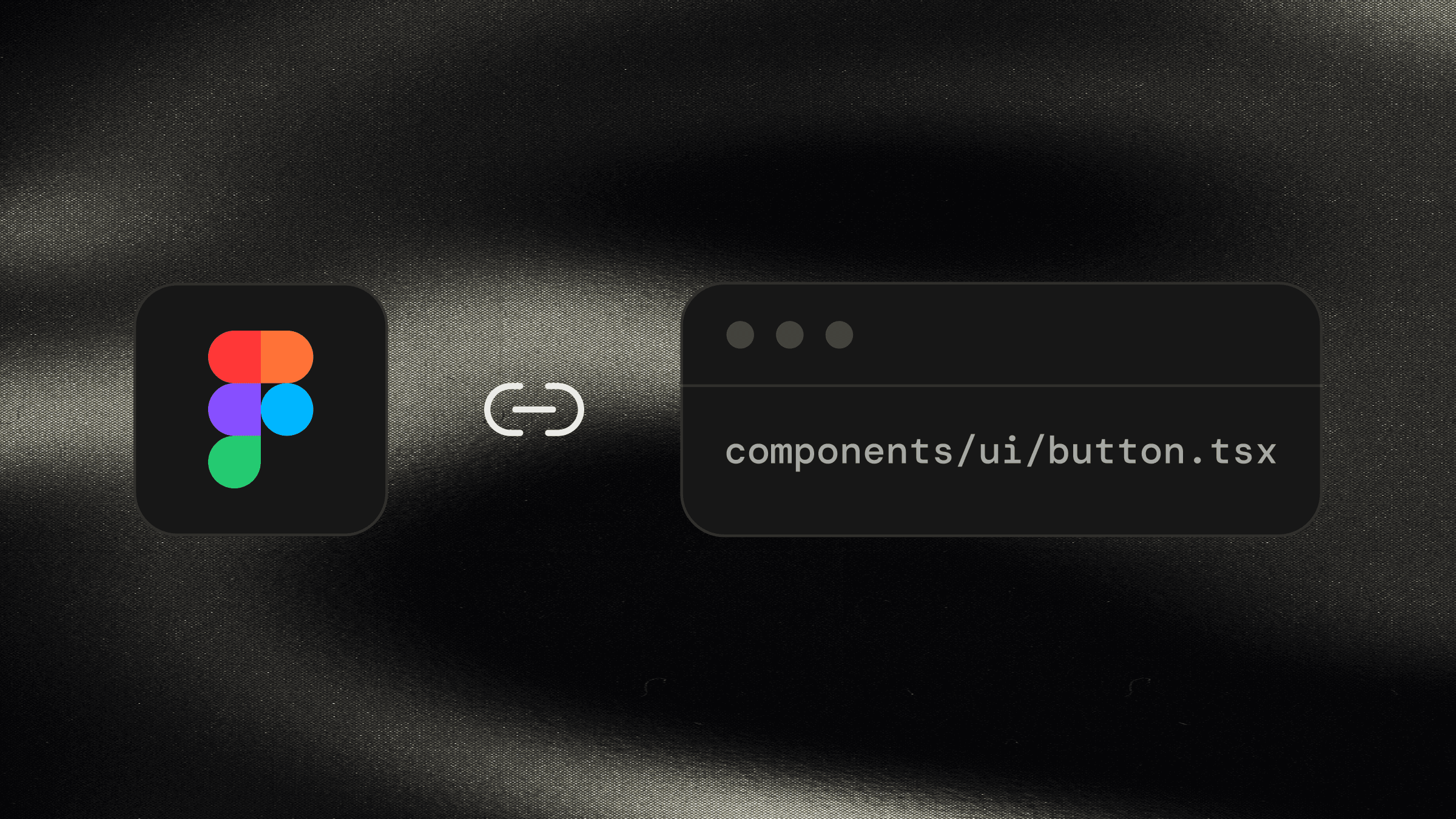
Button | components/ui/button.tsx |
Badge | components/ui/badge.tsx |
Dialog | components/ui/dialog.tsx |
Tabs | components/ui/tabs.tsx |
Select | components/ui/select.tsx |
Accordion | components/ui/accordion.tsx |
Alert | components/ui/alert.tsx |
Card | components/ui/button.tsx |
If your team has customised or restructured components, map them to your exact paths.
Step 6: Add usage notes
You can attach notes that are surfaced in Dev Mode and made available to AI tools. For example:
variant values: default, destructive, outline, secondary, ghost, link
size values: default, sm, lg, icon, icon-sm, icon-lg
These notes strengthen your MCP output and reduce ambiguity.
Step 7: Preview the output
After mapping:
Dev Mode shows the file path
You’ll see preview snippets drawn from your repo
Notes appear as guidance for engineers and AI tools
Check that prop names and variant outputs look correct.
Best practices
Use identical naming between design and code
Matching the exported React component name avoids confusion.
Keep variant labels clear
If the Figma variant matches the prop value, mapping becomes effortless.
Update mappings when refactoring
Treat them like part of your design system maintenance.
Audit periodically
Small naming changes in code can break connections silently.
Example: Connecting a Shadcraft Button
Select a Button instance
Enter Dev Mode
Add a connection with:
Path: components/ui/button.tsx
Name: Button
Add variant and size mapping notes
Confirm the output snippet in Dev Mode
Test with an AI coding tool to verify prop accuracy
Troubleshooting
GitHub connection issues
Usually caused by permissions or incorrect repo URLs.
Component not detected
Ensure the file path is correct and the component is exported.
Prop mismatches
Check variant names and values. They must match prop values exactly.
Missing connections in Dev Mode
Refresh or republish. Confirm Code Connect is enabled for your organisation.
Incorrect AI snippets
Check your example function and TypeScript definitions for mismatches.
Wrapping up
Code Connect gives teams a unified source of truth between design and development. When paired with the Shadcraft shadcn/ui Figma kit, the mapping process becomes straightforward thanks to the kit’s structure, variables, and API alignment.
Developers gain accurate references. Designers work with components that reflect production reality. AI tools produce cleaner, more predictable code. And your design system remains cohesive across tools and teams.
If you’re ready to start connecting components, grab the kit and begin mapping.
Updated Dec 8, 2025